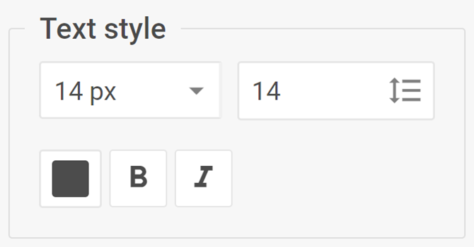
Text style
The complex control for managing the text style within the Diagram elements
Usage
{
    type: "textStyle",

    hidden?: boolean, // false by default
    disabled?: boolean, // false by default

    css?: string,
    width?: string | number | "content", // "content" by default
    height?: string | number | "content", // "content" by default
    padding?: string | number, // "0 16px" by default

    label?: string,
    labelAlignment?: "left" | "right" | "center", // "left" by default
    align?: "start" | "center" | "end" | "between" | "around" | "evenly", // "between" by default
    compact?: boolean, // false by default

    // Service properties
    $properties?: object
}
Description
Basic properties
type- (required) the type of a control. Set it to "textStyle"hidden- (optional) defines whether the control is hidden. false by defaultdisabled- (optional) defines whether the control is enabled (false) or disabled (true). false by defaultcss- (optional) adds style classes to the controlwidth- (optional) the width of the control. "content" by defaultheight- (optional) the height of the control. "content" by defaultpadding- (optional) sets the padding for the content inside the control group. "0 16px" by defaultlabel- (optional) specifies a label for the controllabelAlignment- (optional) defines the position of the label. "left" by defaultalign- (optional) sets the alignment of controls inside the control group. "between" by defaultcompact- (optional) specifies the compact mode, removes indents and frame. false by default
Service properties
$properties- (optional) allows you to override values of basic controls within a complex control. You can configure the following elements of the Text style control based on the basic controls:fontSize- (combo) sets the font sizelineHeight- (input) sets the line heightfontColor- (colorpicker) sets the font colorfontWeight- (toggle) sets the font weightfontStyle- (toggle) sets the font style
Example
const editor= new dhx.DiagramEditor("editor_container", {
    type: "mindmap",
    view: {
        editbar: {
            properties: {
                $shape: [
                    {
                        type: "textStyle",
                        label: "Text style",
                        $properties: {
                            fontSize: {
                                value: 20,
                                options: [
                                    { id: 10, value: "10px" },
                                    { id: 20, value: "20px" },
                                    { id: 30, value: "30px" },
                                    { id: 40, value: "40px" }
                                ]
                            }
                        }
                    }
                ]
            }
        }
    }
});