Scheduler Markup
The standard scheduler's markup looks like this:
<div id="scheduler_here" class="dhx_cal_container" style='width:100%; height:100%;'>
<div class="dhx_cal_navline">
<div class="dhx_cal_prev_button"> </div>
<div class="dhx_cal_next_button"> </div>
<div class="dhx_cal_today_button"></div>
<div class="dhx_cal_date"></div>
<div class="dhx_cal_tab" data-tab="day"></div>
<div class="dhx_cal_tab" data-tab="week"></div>
<div class="dhx_cal_tab" data-tab="month"></div>
</div>
<div class="dhx_cal_header"></div>
<div class="dhx_cal_data"></div>
</div>
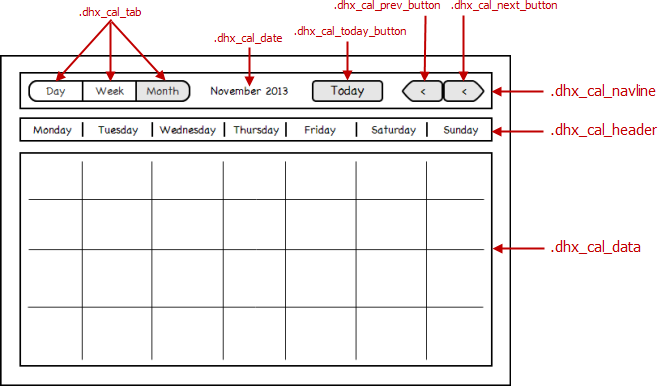
Tabs positioning
Starting from v7.0, the .dhx_cal_navline element is a flex container and tabs are located according to the order style.
Versions 6.0 and older
Default ('terrace') skin
Initially, the default ('terrace') skin ignores the CSS properties used to set the tab's position (e.g. style="right:204px;") and locates the tab using its specific logic: the default views are presented
as a segmented button at the left side but additional views are placed as individual buttons at the right side.
To set the position manually (e.g. in the markup), set the fix_tab_position parameter to false to disable the default behaviour and set the coordinates with CSS properties:
scheduler.config.fix_tab_position = false;
...
scheduler.init('scheduler_here',new Date(2027,05,11),"week");
Notice that you can use the following CSS classes to create a segmented button:
- dhx_cal_tab_last - makes the right border rounded
- dhx_cal_tab_first - makes the left border rounded
- dhx_cal_tab_standalone - makes the both borders rounded
For example, to set the 'day'-'week'-'month' segmented button in the default skin manually, you can specify the markup as in:
<div class="dhx_cal_tab dhx_cal_tab_first" data-tab="day" style="left:14px;"></div>
<div class="dhx_cal_tab" data-tab="week"  style="left: 75px;"></div>
<div class="dhx_cal_tab dhx_cal_tab_last" data-tab="month" style="left:136px"></div>
Adding/deleting views' tabs
Adding a tab
To add a new tab to the header, add a div with the "dhx_cal_tab" class as a child node of the "dhx_cal_navline" element:
<div class="dhx_cal_navline">
    ...
    <div class="dhx_cal_tab" data-tab="day"></div>
    <div class="dhx_cal_tab" data-tab="week"></div>
    <div class="dhx_cal_tab" data-tab="timeline"></div>
    <div class="dhx_cal_tab" data-tab="month"></div>
</div>
The view that will be opened on a tab click is defined by the data-tab attribute and specified as (viewName).
Note, the tab can have several CSS classes applied, but the "dhx_cal_tab" class must go first.
Deleting a tab
To remove a tab from the header, remove the related div from the markup:
Removing the 'month' tab from the header:
<div class="dhx_cal_navline">
    ...
    <div class="dhx_cal_tab" data-tab="day"></div>
    <div class="dhx_cal_tab" data-tab="week"></div>
</div>
Even if the tab is removed, the related view is still accessible programmatically with the setCurrentView and updateView methods.
Hiding the navigation buttons
To hide the navigation buttons in the scheduler's header, set the 'display:none' style for the related divs as in:
Hiding the navigation buttons in the header:
<style>
.dhx_cal_prev_button, .dhx_cal_next_button{
display:none;
}
</style>
<div id="scheduler_here" class="dhx_cal_container" style='width:100%; height:100%;'>
<div class="dhx_cal_navline">
<div class="dhx_cal_prev_button"> </div>
<div class="dhx_cal_next_button"> </div>
<div class="dhx_cal_today_button"></div>
...
</div>
<div class="dhx_cal_header"></div>
<div class="dhx_cal_data"></div>
</div>
Hiding the header of scheduler
To hide the entire scheduler's header, set 'display:none':
<style>
    .dhx_cal_navline{
        display:none;
    }
</style>