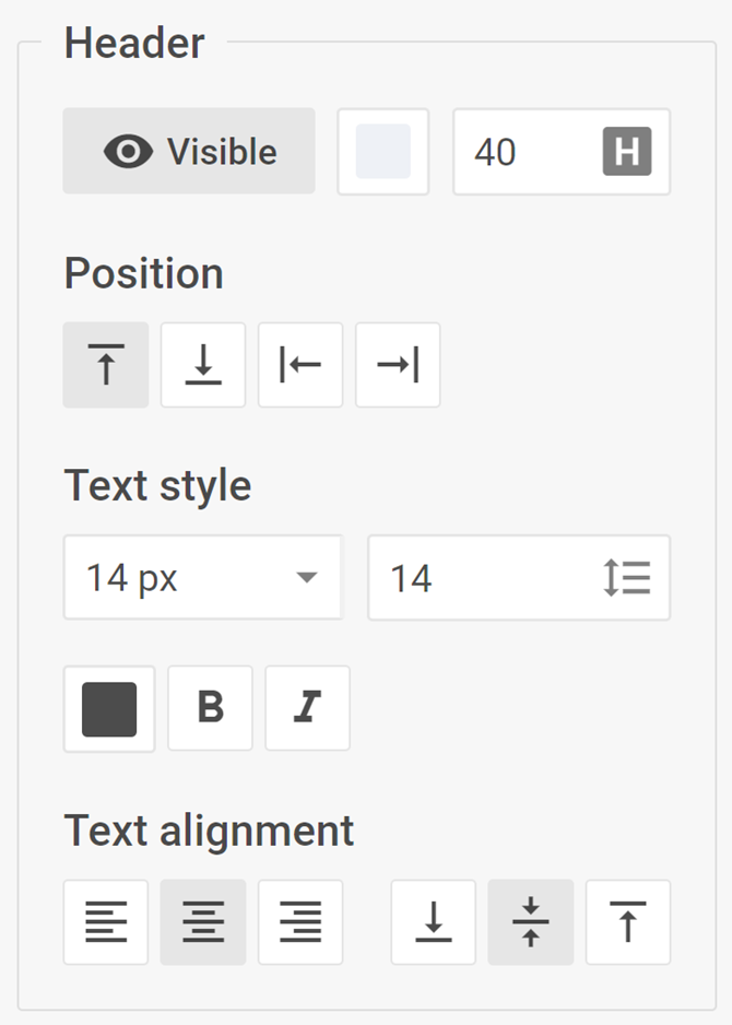
Header
The complex control for displaying and modifying the header of "group" and "swimlane" elements of the Diagram editor

info
The Header control is available only for group and swimlane elements in the default mode of the Diagram editor.
Usage
{
    type: "header",

    hidden?: boolean, // false by default
    disabled?: boolean, // false by default

    css?: string,
    width?: string | number | "content", // "content" by default
    height?: string | number | "content", // "content" by default
    padding?: string | number, // "0 16px" by default

    label?: string,
    labelAlignment?: "left" | "right" | "center", // "left" by default
    align?: "start" | "center" | "end" | "between" | "around" | "evenly", // "start" by default
    compact?: boolean // false by default
}
Description
Basic properties
type- (required) the type of a control. Set it to "header"hidden- (optional) defines whether the control is hidden. false by defaultdisabled- (optional) defines whether the control is enabled (false) or disabled (true). false by defaultcss- (optional) adds style classes to the controlwidth- (optional) the width of the control. "content" by defaultheight- (optional) the height of the control. "content" by defaultpadding- (optional) sets the padding for the content inside the control group. "0 16px" by defaultlabel- (optional) specifies a label for the controllabelAlignment- (optional) defines the position of the label. "left" by defaultalign- (optional) sets the alignment of controls inside the control group. "start" by defaultcompact- (optional) specifies the compact mode, removes indents and frames. false by default
Example
const editor= new dhx.DiagramEditor("editor_container", {
    type: "default",
    view: {
        editbar: {
            properties: {
                $group: [
                    {
                        type: "header",
                        label: "Group header style"
                    }
                ]
            }
        }
    }
});