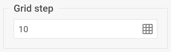
Grid step
The complex control for displaying and modifying a grid step of the Diagram editor
Usage
{
    type: "gridStep",

    hidden?: boolean, // false by default
    disabled?: boolean, // false by default

    css?: string,
    width?: string | number | "content", // "content" by default
    height?: string | number | "content", // "content" by default
    padding?: string | number, // "0 16px" by default

    label?: string,
    labelAlignment?: "left" | "right" | "center", // "left" by default
    readOnly?: boolean, // false by default
    wrap?: boolean // true by default
}
Description
Basic properties
type- (required) the type of a control. Set it to "gridStep"hidden- (optional) defines whether the control is hidden. false by defaultdisabled- (optional) defines whether the control is enabled (false) or disabled (true). false by defaultcss- (optional) adds style classes to the controlwidth- (optional) the width of the control. "content" by defaultheight- (optional) the height of the control. "content" by defaultpadding- (optional) sets the padding for the content inside the control group. "0 16px" by defaultlabel- (optional) specifies a label for the controllabelAlignment- (optional) defines the position of the label. "left" by defaultreadOnly- (optional) sets the readonly mode for the control. false by defaultwrap- (optional) allows displaying the external wrapping. true by default
Example
const editor= new dhx.DiagramEditor("editor_container", {
    type: "default",
    view: {
        editbar: {
            properties: {
                $default: [
                    {
                        type: "gridStep",
                        readOnly: true
                    }
                ]
            }
        }
    }
});