Arrange
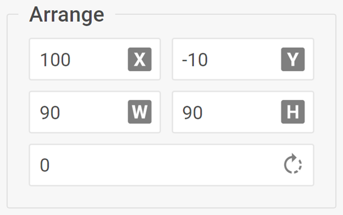
The complex control for editing width, height, rotation angle, x and y properties of a Diagram element
info
The Arrange control is available for all elements (excluding the line and lineTitle elements) in the default mode of the Diagram editor.
Usage
{
    type: "arrange",

    hidden?: boolean, // false by default
    disabled?: boolean, // false by default

    css?: string,
    width?: string | number | "content", // "content" by default
    height?: string | number | "content", // "content" by default
    padding?: string | number, // "0 16px" by default

    label?: string,
    labelAlignment?: "left" | "right" | "center", // "left" by default
    align?: "start" | "center" | "end" | "between" | "around" | "evenly", // "start" by default
    compact?: boolean, // false by default

    // Service properties
    $properties?: object
}
Description
Basic properties
type- (required) the type of a control. Set it to "arrange"hidden- (optional) defines whether the control is hidden. false by defaultdisabled- (optional) defines whether the control is enabled (false) or disabled (true)css- (optional) adds style classes to the controlwidth- (optional) the width of the control. "content" by defaultheight- (optional) the height of the control. "content" by defaultpadding- (optional) sets the padding for the content inside the control group. "0 16px" by defaultlabel- (optional) specifies a label for the controllabelAlignment- (optional) defines the position of the control label. "left" by defaultalign- (optional) sets the alignment of controls inside the control group. "start" by defaultcompact- (optional) specifies the compact mode, removes indents and frame. false by default
Service properties
$properties- (optional) allows you to override values of basic controls within a complex control. You can configure the following elements of the Arrange control based on the basic controls:
Example
const editor= new dhx.DiagramEditor("editor_container", {
    type: "default",
    view: {
        editbar: {
            properties: {
                rectangle: [
                    {
                        type: "arrange",
                        disabled: true,
                        $properties: {
                            angle: { hidden: true } // configuration of the "input" basic control
                        }
                    }
                ]
            }
        }
    }
});