Popup Messages and Modal Boxes
Messages are used in the Gantt Chart to notify a user about an error, confirm or deny an action, choose one of the options and so on. Gantt Chart messages use the fork of the dhtmlxMessage repository as their basis. So, all the functionality of dhtmlxMessage is actual for dhtmlxGantt messages.
There are two main types of messages: a simple popup message box and a modal message box with buttons that blocks the work of an application.
A modal message box can belong to one of three possible types:
Basic Popup Message
To create a basic modal message box, use the gantt.message method. The obligatory parameter of the method is the text of the message:
gantt.message("The task is updated");
There are three types of message boxes:
- a default message box (type:"info")

- an error message box (type:"error")

- a warning message box (type:"warning")

To create a necessary message box, you need to define the type property with the corresponding value:
// creating an error message box
gantt.message({type:"error", text:"Invalid data format"});
Related sample: Gantt message types
To apply different styles to a message box you need to specify a CSS class through the type parameter as described here.
Positioning message boxes
By default, a popup message box appears in the right top corner of the window. It doesn't prevent the work of the parent application, unlike modal message boxes that overlay the parent application and block its work. You can change the position of a message box by using the gantt.message.position property:
gantt.message.position = 'bottom';
Related sample: Message position
There are four possible values for the message position:
top - displays a message box in the right top corner of the window, set by default
bottom - displays a message box in the right bottom corner of the window
left - displays a message box on the left side of the window under Gantt
right - displays a message box on the right side of the window under Gantt
Expire Interval
It's possible to customize the expire interval for a message box with the help of the expire parameter. It is the time period after the end of which the message box disappears (in milliseconds). By default, the expire interval is equal to 4000 milliseconds.
You can either change this value or to cancel the expire period at all, by setting the expire parameter to "-1". In this case a message box will disappear only on a mouse click.
gantt.message({
    type:"error",
    text:"Invalid data format",
    expire:10000
});
Hiding a Message Box with API
To hide the specified message box manually and not to wait while it hides automatically, you can use the gantt.message.hide(boxId) method. It takes one parameter:
- boxId - the box id specified in the box's constructor
gantt.message({
    id:"myBox",
    text:"Page is loaded"
});

gantt.message.hide("myBox");
Modal Message Boxes
Modal message boxes prevent the work of the parent app, until a necessary action is performed (usually, button clicking). They close on a button click and a callback function, if any is executed.
There exist three types of modal message boxes:
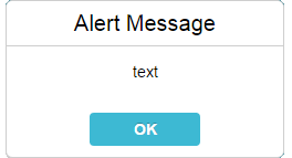
- Alert Message Box - an alert box with a button;
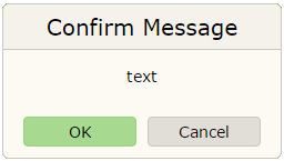
- Confirm Message Box - a confirmation box with two buttons (to confirm or to cancel);
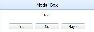
- Modalbox - a modal message box with an unlimited number of buttons.
Common properties of the boxes are:
- id - the message box's id;
- title - the text of the header;
- type - the type of the message box (a warning or an error);
- text - the text of the message box's body;
- ok - the text of the "OK" button;
- cancel - the text of the "Cancel" button (for the confirm box);
- callback - the function called on button click. Takes true or false as the parameter (subject to the clicked button);
- position - for now supports only one value - "top", any other value will result in center-align;
- width - the width of the modal box (set as CSS <length> or <percentage> values, e.g. "100px", "50%");
- height - the height of the modal box (set as CSS <length> or <percentage> values, e.g. "100px", "50%").
Alert Message Box

An alert message box contains the "OK" button. To set the text of the "OK" button, use the ok parameter with the text as a value:
- a short form (contains just the text of a message - implicit usage of the parameter 'text'. The other parameters take default values):
gantt.alert("Text");
- a full form (contains several available parameters. Non-specified parameters take default values)
gantt.alert({
    text:"some text",
    title:"Error!",
    ok:"Yes",
    callback:function(){...}
});
Confirm Message Box

A confirm message box has two buttons: the "OK" button and the "Cancel" one. The text of the buttons is defined in the properties with the corresponding names.
- a short form
gantt.confirm("ConfirmText");
- a full form
gantt.confirm({
    text: "Continue?",
    ok:"Yes",
    cancel:"No",
    callback: function(result){
        gantt.message("Result: "+result);
    }
});
Modal Box

A modalbox possesses some peculiar features:
- its text can include any HTML content;
- it may have many buttons specified in the buttons array that contains the text values of the buttons;
- the callback function takes the index of the chosen button as a parameter.
gantt.modalbox({
    title:"Settings",
    text: " ... html code here... ",
    buttons:["Save", "Defaults", "Cancel"],
    callback: function(result){
        gantt.alert(result);
    }
});
Configuring modalbox buttons
There are two main ways to define the configuration of modalbox buttons:
- a short form:
gantt.modalbox({
    // other settings
    buttons:["Save", "Delete", "Cancel"],
    callback: function(result){
        switch(result){
            case "0":
                //Save
                break;
            case "1":
                //Delete
                break;
            case "2":
                //Cancel
                break;
        }
    }
});
The result of the callback function will be equal to the stringified index of a pressed button from the array ("0", "1", "2",...). Each button will receive a CSS class from its label converted to the lower case, e.g. gantt_save_button, gantt_delete_button, gantt_cancel_button.
These classes can be used to style buttons:
.gantt_delete_button div{
    background:red;
}
In case the same button name is used by several popups that should be styled differently, the type config can be used:
gantt.modalbox({
    // other settings
    type:"special_popup",
    buttons:["Save", "Delete", "Cancel"]
});
The type will be prefixed with the "gantt_" string and added as a class name to the popup element:
.gantt_special_popup .gantt_delete_button div{
    background:red;
}
- a full form:
The CSS classes of buttons and callback values can be defined explicitly using a longer form of configuration:
gantt.modalbox({
    // other settings
    buttons: [
        { label:"Save",   css:"link_save_btn",   value:"save" },
        { label:"Cancel", css:"link_cancel_btn", value:"cancel" },
        { label:"Delete", css:"link_delete_btn", value:"delete" }
    ],
    callback: function(result){
        switch(result){
            case "save":
                //Save
                break;
            case "cancel":
                //Cancel
                break;
            case "delete":
                //Delete
                break;
        }
    }
});
The label parameter is mandatory, while css and value options can be omitted. Missing parameters will be calculated as in the short form of buttons configuration: CSS will be inherited from a lower-cased button label and the button index will be used as a value.
The css will be prefixed with the "gantt_" string and added to the button element as a class name:
.gantt_link_delete_btn div{
    background:red;
}
Hiding Modal Message Boxes
To hide a modal message box manually, you can use the gantt.modalbox.hide() method. As a parameter it takes the div container of the modalbox:
var box = gantt.modalbox({
    title:"Settings",
    text: " ... html code here... ",
    buttons:["Save", "Defaults", "Cancel"],
    callback: function(result){
        gantt.alert(result);
    }
});

gantt.modalbox.hide(box);
For the alert and confirm modal boxes, you also need to use the gantt.modalbox.hide() method:
var box = gantt.confirm({
    text: "Continue?",
    ok:"Yes",
    cancel:"No",
    callback: function(result){
        gantt.message("Result: "+result);
    }
});

gantt.modalbox.hide(box);
How Gantt Works with Modalbox Buttons
By default, the names of buttons are set as text. If the name of a button is set as an HTML element (e.g. to make the font bold, or add a material icon), the result of the callback function on clicking the button will be null.
It happens as Gantt watches certain attributes of the clicked element's parent. If there aren't the expected attributes, Gantt will return null.
Besides, Gantt wraps all the elements you specify for the buttons into the <div> tags.
Thus if you return a string element when a text is clicked, its parent will be an empty <div> element and you'll get null.
But when a button is clicked outside the text, its parent is an element with all the necessary attributes, so you'll get some more expected result:
- true/false for the confirm box
- for the modalbox:
- the number of the element in an array (for the short form)
- the value of the
valueparameter (for the full form)
It means that if you want to set an HTML element as a button name, you need to wrap everything into two div elements that have the data-result attribute. For example:
gantt.confirm({
    ok:`<div data-result="yes"><div data-result="yes"><i>Yes</i></div></div>`,
    cancel:`<div data-result="no"><div data-result="no"><i>No</i></div></div>`,
});

gantt.modalbox({
  buttons: [
   { label:`<div data-result="yes">
        <div data-result="yes"><i>Yes</i></div>
     </div>`,
     css:"link_save_btn", value:"yes" },
   { label:`<div data-result="no">
        <div data-result="no"><i>No</i></div>
     </div>`,
     css:"link_cancel_btn", value:"no" },
   { label:`<div data-result="cancel">
        <div data-result="cancel"><i>Cancel</i></div>
     </div>`,
     css:"link_cancel_btn", value:"cancel" },
  ],
});
If you need to use some other elements for a button, all the parent elements should also have the data-result attribute. In the example below
the <u> tags are used for the name of the button. So, they have the data-result attribute the same as the other two <div> parent elements of the button:
gantt.confirm({
  ok:`<div data-result="yes">
    <div data-result="yes"><u data-result="yes"><i>Yes</i></u></div>
  </div>`,
  cancel:`<div data-result="no">
    <div data-result="no"><u data-result="no"><i>No</i></u></div>
  </div>`,
});

gantt.modalbox({
  buttons: [
    { label:`<div data-result="yes">
        <div data-result="yes">
            <u data-result="yes"><i>Yes</i></u>
        </div>
      </div>`,
      css:"link_save_btn",  value:"yes" },
    { label:`<div data-result="no">
        <div data-result="no">
            <u data-result="no"><i>No</i></u>
        </div>
      </div>`,
      css:"link_cancel_btn", value:"no" },
    { label:`<div data-result="cancel">
        <div data-result="cancel">
            <u data-result="cancel"><i>Cancel</i></u>
        </div>
      </div>`,
      css:"link_cancel_btn", value:"cancel" },
  ],
});
Styling
For any type of the message box you can define a custom style to achieve the desired look. Generally, the appropriate CSS class is specified through the type parameter: you define a CSS class and set the parameter to its name.
There are some rules related to setting the 'type' parameter you should keep in mind:
- To set a CSS class for the alert and confirm boxes, you must initialize such a box using the 'window-related' way.
- To set a CSS class for the message boxes, you must initialize such a box using the 'common' way.
- The name of a CSS class should go with the 'gantt-' prefix.
- To apply the style correctly, it's necessary to use the name of the class as .gantt-some div to specify that it is intended for the element inside a gantt message.
<style type="text/css">
.gantt-myCss div{
    font-weight:bold;
    color:wheat;
    background-color:crimson;
}
</style>


gantt.message({ type:"myCss", text:"some text" });
Related sample: Styling message boxes
Modal Windows and Keyboard Interaction
The keyboard functionality for modal boxes is controlled by the gantt.message.keyboard property. Initially, it's set to true.
By default, modal boxes block keyboard events of the page. The only keys that can be used are:
- "space" and "enter" - sets the true value as a modal box result;
- "escape" - sets the false value as a modal box result.
By setting the keyboard property to false, you'll enable keyboard events (and disable the above mentioned keys):
gantt.message.keyboard = false;
gantt.modalbox({...});
It allows using the full keyboard, e.g. for typing values into inputs inside modal boxes.
Back to top