menu
Description
Optional. Specifies the context menu visibility (if boolean) or configuration parameters (if function)
Usage
menu?: boolean;
// or
menu?: function(config: object);
Show or Hide Context Menu
If you want to hide the context menu, set the menu config to false. To make the default context menu visible, set the menu config to true.
menu: true // display the default context menu

// or

menu: false // hide the context menu
Modify Context Menu
If you want to modify a context menu, set the menu config to a callback that takes the config object as a parameter. The config object may have the following structure:
config: {
    type: "user" | "toolbar" | "task",
    id?: string | number,
    source?: (string | number)[],
    store: object
};
Parameters
The config object may include the following parameters:
type- (required) the type of the context menu. Here you can specify one of the following values:"user"- the context menu related to users"toolbar"- the context menu related to toolbar"task"- the context menu related to tasks
id- (optional | required) the ID of the project. This parameter is required iftype: "toolbar"source- (optional | required) the array that includes the IDs of tasks. This parameter is required iftype: "task"store- (required) the readonly DataStore, that should be passed to thegetMenuOptions()method
Returns
The callback should return one of the following values:
-
boolean-trueto display a default context menu;falseto hide a context menu -
object[]- the array of objects that store data for context menu items. Each object may have the following structure:{
id: string | number,
icon?: string,
label?: string,
hotkey?: string,
value?: Date,
data?: object[],
handler?: function,
css?: string,
type?: string
}-
id- (required) the ID of the menu item -
icon- (optional) the icon for the menu item (by default taken from thewxifont) -
label- (optional) the text for the menu item -
hotkey- (optional) a hotkey for the action from this menu item -
value- (optional) the due date, valid for "datepicker" -
data- (optional) the array of objects that store subitems of the menu item -
handler- (optional) the handler that allows you to perform an action for a custom menu item -
css- (optional) the css class -
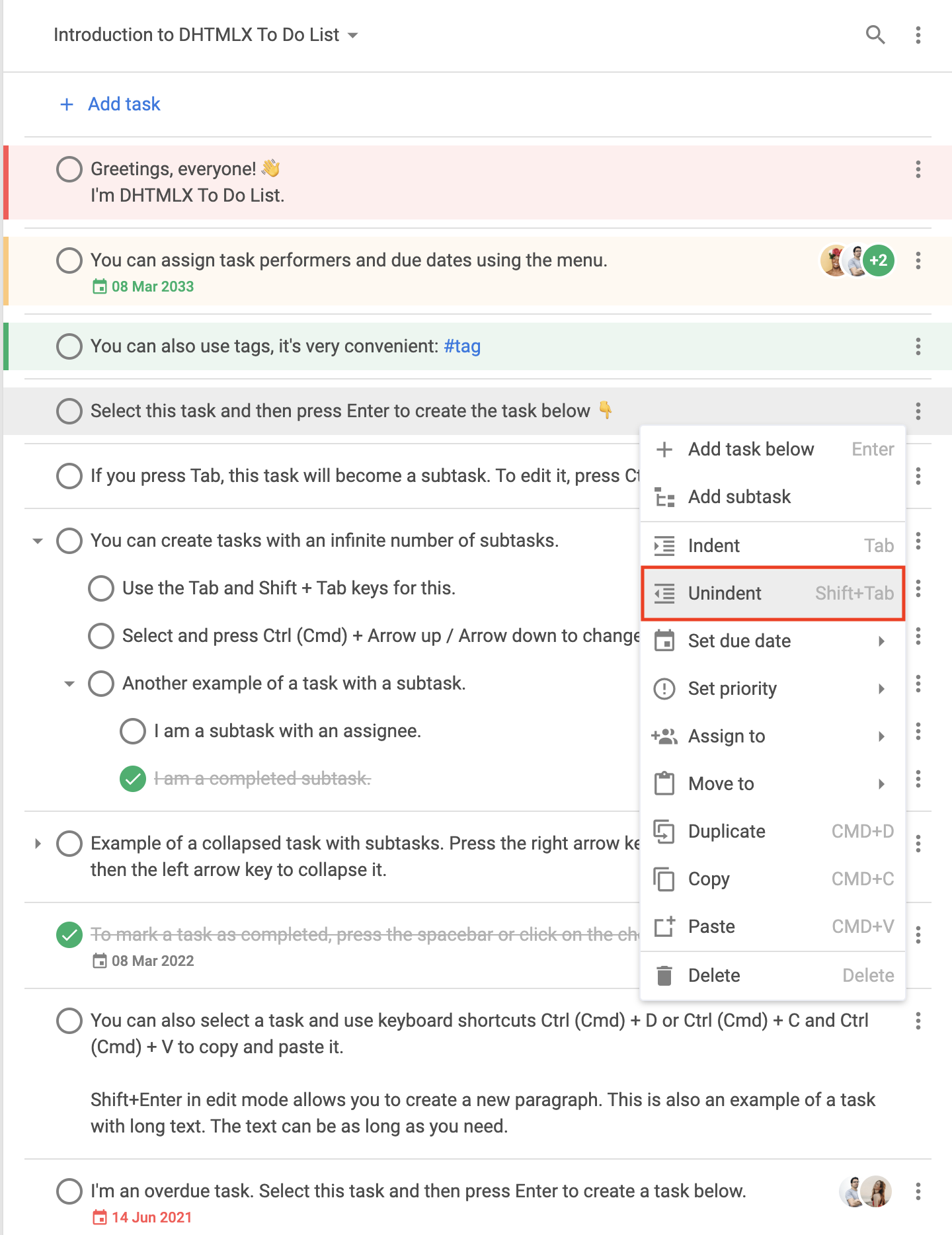
type- (optional) the menu item type. Here you can specify the following types:"item"- the basic menu item
The
"item"type default structure{
type: "item",
id: string,
icon: string,
label: string,
hotkey: string,
data: [ // if required
// ... same objects for sub-items
]
}
"separator"- the line for separating menu items
The
"separator"type default structure{ type: "separator" }"priority"- the menu item intended for setting priorities
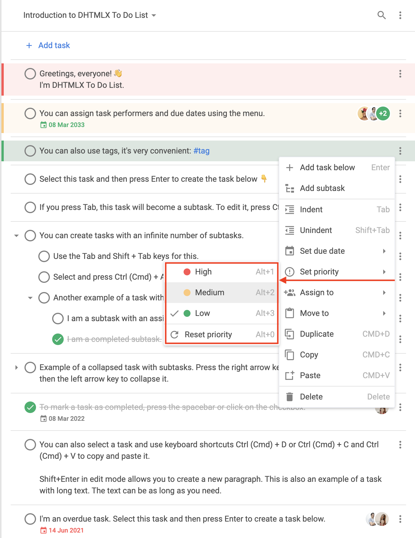
The
"priority"type default structureBy default, there are High, Medium, and Low items displayed in the submenu of the
"setPriority"item.{ // High priority
type: "priority",
label: "High",
color: "#ff5252",
hotkey: "Alt+1",
icon: "empty",
id: "priority:1"
},
{ // Medium priority
type: "priority",
label: "Medium",
color: "#ffc975",
hotkey: "Alt+2",
icon: "empty",
id: "priority:2"
},
{ // Low priority
type: "priority",
label: "Low",
color: "#0ab169",
hotkey: "Alt+3",
icon: "empty",
id: "priority:3"
}
"datepicker"- the menu item intended for setting dates
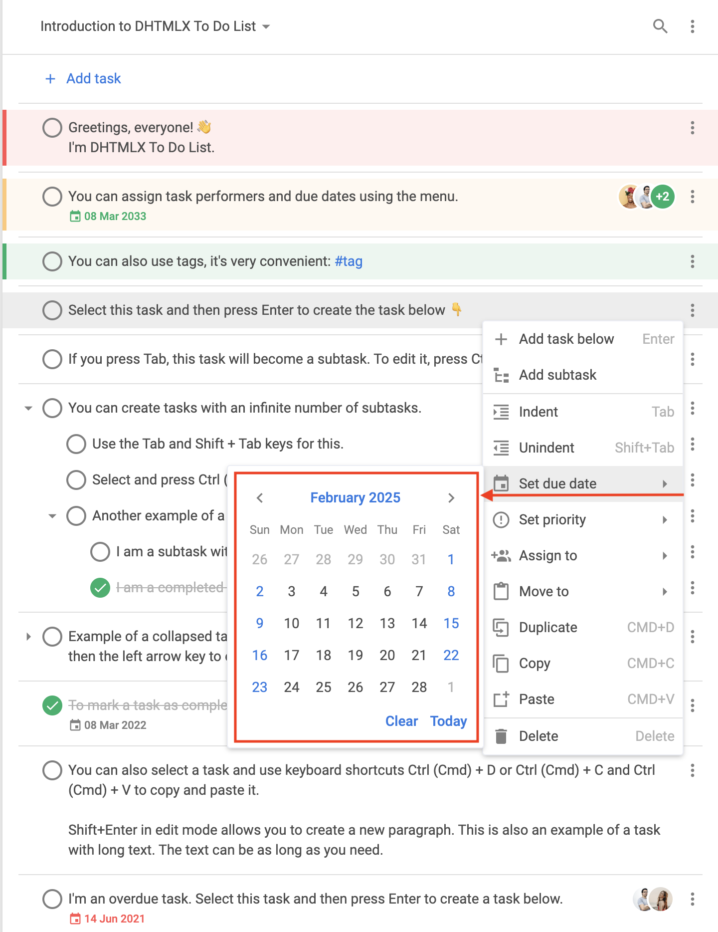
The
"datepicker"type default structureBy default, the
"datepicker"item displayed in the submenu of the"setDate"item.{
type: "datepicker",
id: "dueDate", // default ID
value: new Date(), // selected date
store: object // readonly
}
"user"- the menu item intended for assigning users to tasks
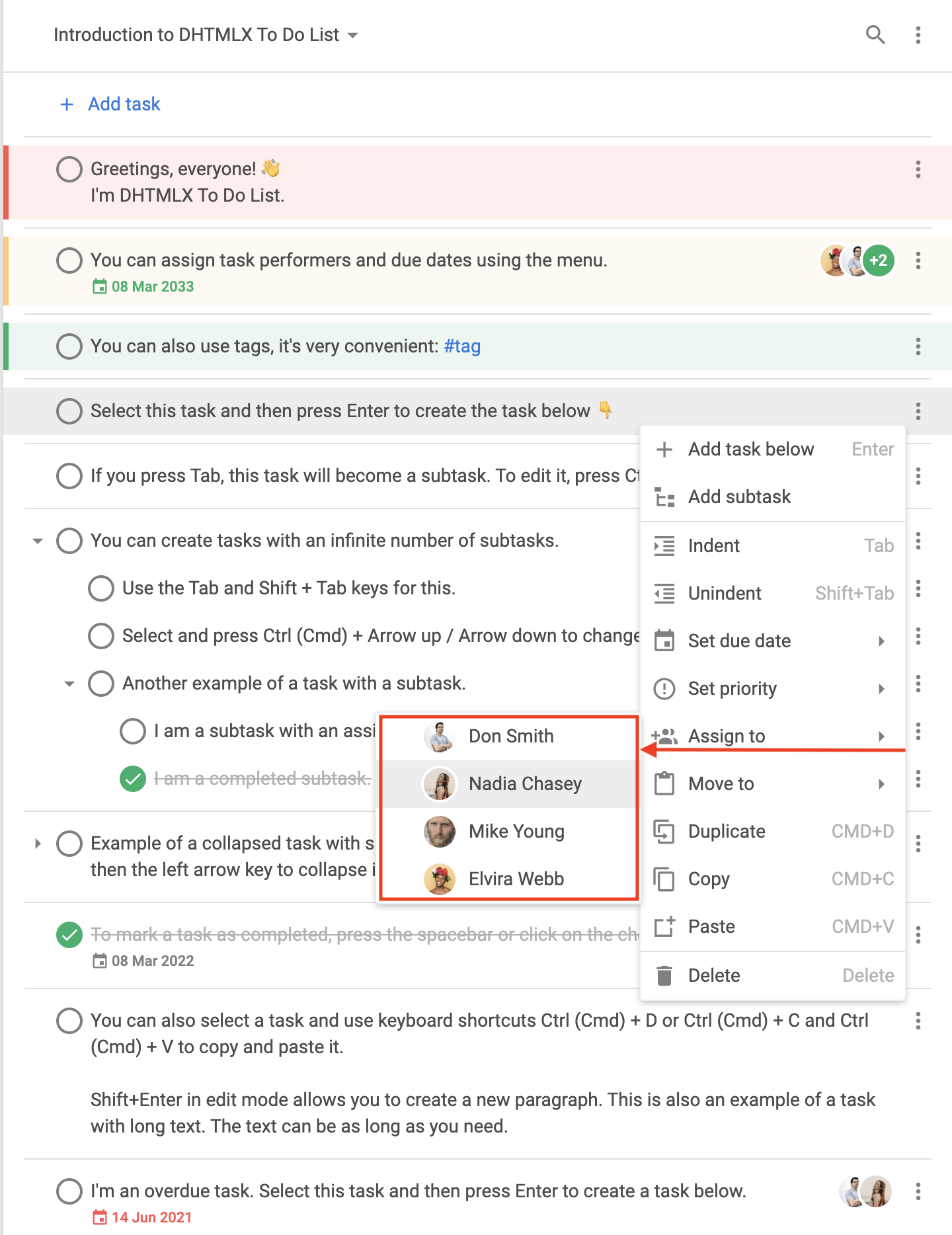
The
"user"type default structure{
type: "user",
id: string,
label: string,
avatar: string, // the path to the user avatar
color: string, // the color for the automatic avatar if the link to the picture is not provided, default color is "#0AB169"
icon: string, // the icon displayed to the left of the avatar and marks the user as assigned
clickable: boolean, // the value that marks the item as clickable
checked: boolean // the value that marks the user that this option represents as assigned
}
-
Example
const { ToDo, Toolbar, getMenuOptions } = todo;

const menu = function (config) {
    let options = getMenuOptions(config);

    const { source, store, type } = config;
    if (type === "task") {
        // leaving only some of the default menu options
        options = options.filter(o => {
            return (
                o.id == "addSubtask" ||
                o.id == "setDate" ||
                o.id == "setPriority" ||
                o.id == "assign"
            );
        });
        // adding new menu options
        options.push({ type: "separator" });
        options.push({
            type: "item",
            icon: "calendar",
            label: "Add current date",
            id: "addDate",
            handler: () => {
                source.forEach(id => {
                    list.updateTask({
                        id,
                        task: {
                            due_date: new Date()
                        }
                    });
                });
            }
        });
        const task = store.getTask(source[0]);
        if (task.checked) {
            options.push({
                type: "item",
                icon: "undo",
                label: "Mark incomplete",
                id: "uncheck",
                handler: () => {
                    list.uncheckTask({
                        id
                    });
                }
            });
        } else {
            options.push({
                type: "item",
                icon: "check",
                label: "Complete",
                id: "check",
                handler: () => {
                    source.forEach(id => {
                        list.checkTask({
                            id
                        });
                    });
                }
            });
        }
    }

    return options;
};

new ToDo("#root", {
    tasks,
    users,
    projects,
    menu
});
Change log: The menu config was added in v1.3
Related samples: