Configuration
You can configure the RichText appearance and behavior with the following properties:
menubar— show or hide the top menubartoolbar— configure toolbar visibility and buttonsfullscreenMode— start the editor in fullscreenlayoutMode— switch between the"classic"and"document"layoutsvalue— set the initial HTML contentlocale— apply a localization object on initializationdefaultStyles— set default styles for specific block typesimageUploadUrl— set the endpoint for image uploadstriggers— enable @mentions, #tags, and custom dropdown triggers (see the Mentions and tags guide)
Layout modes
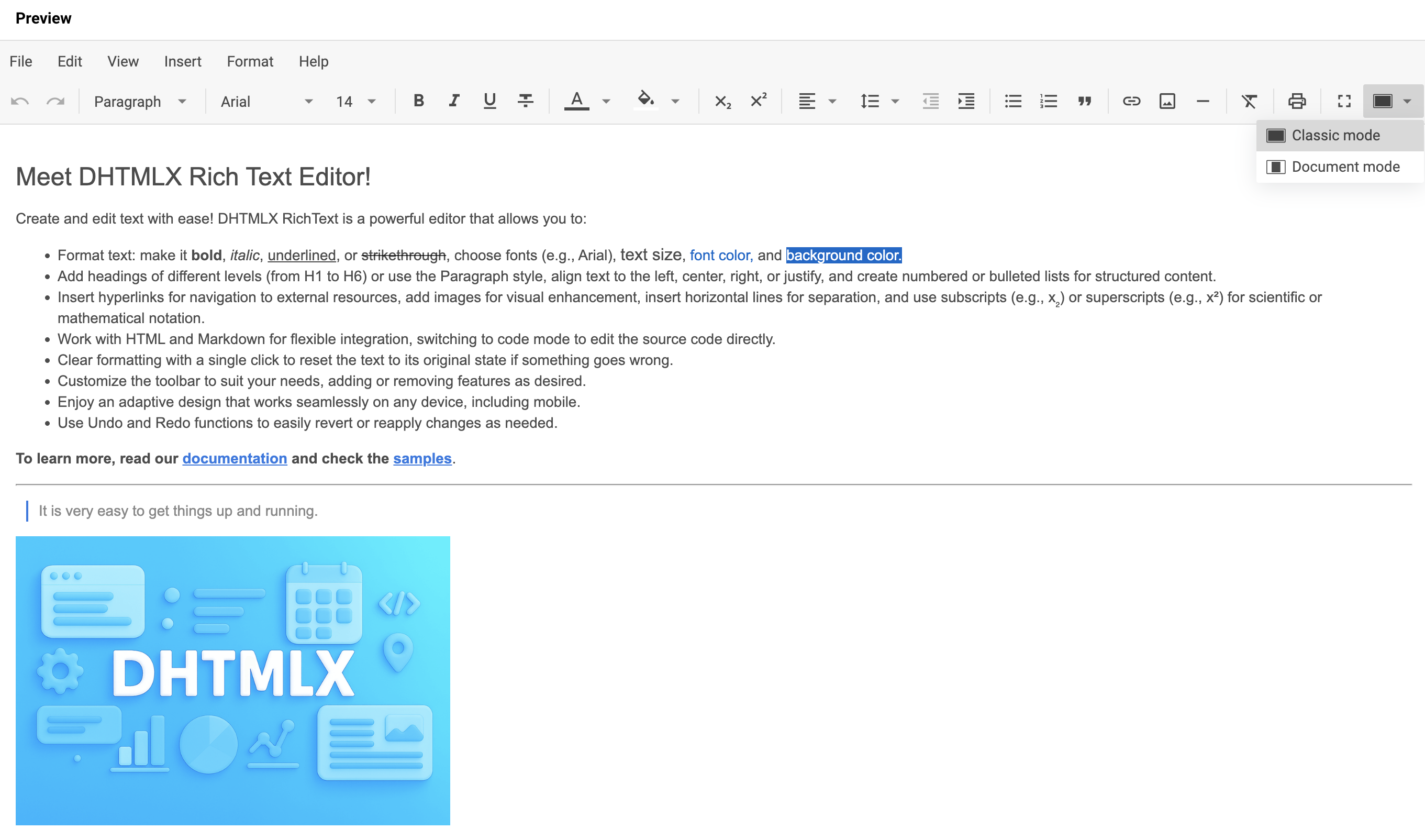
RichText supports two layout modes for the editing area:
"classic"— the edit area fills the entire page
"document"— the edit area mimics a document page
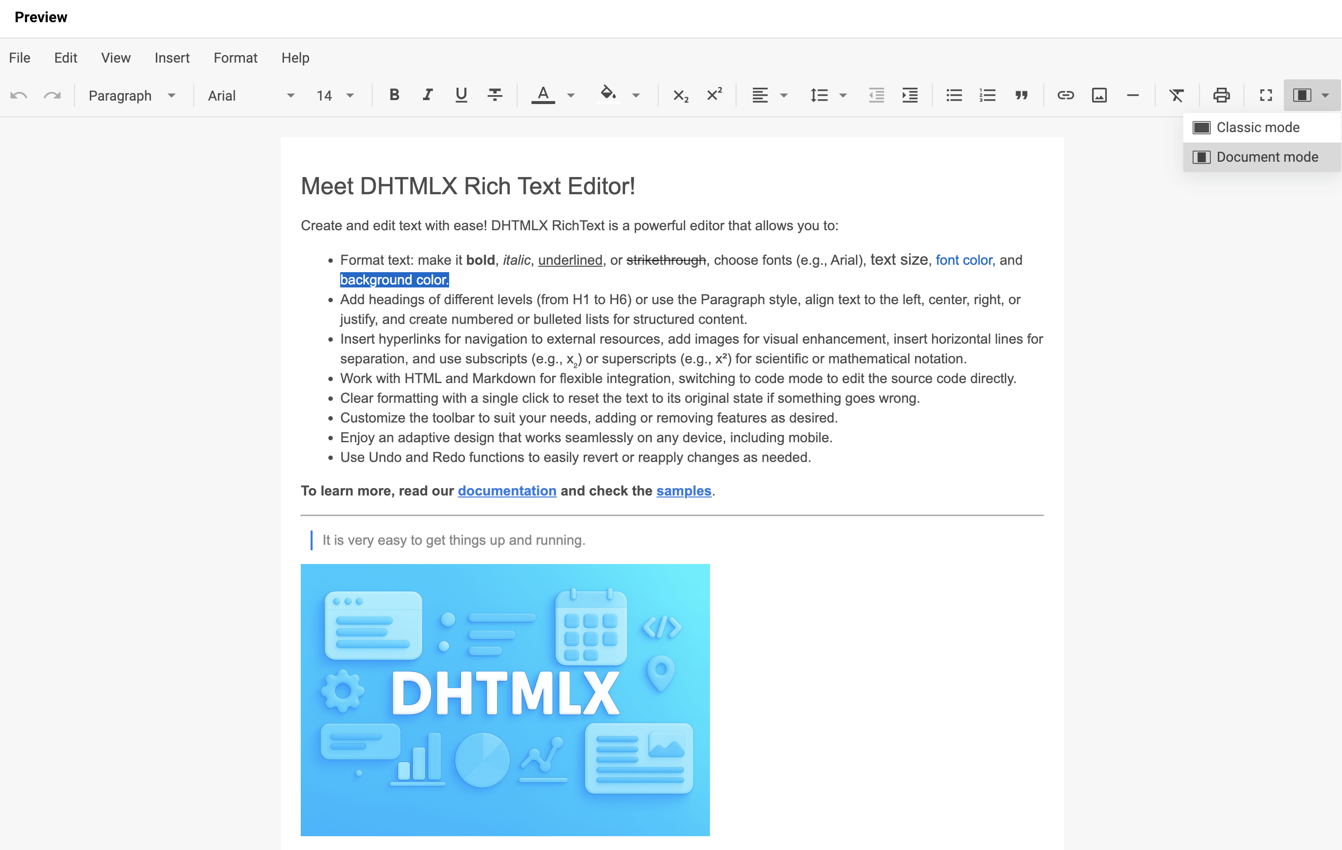
Set the layoutMode property during initialization to choose the mode:
const editor = new richtext.Richtext("#root", {
    layoutMode: "document"
});
Related sample: RichText. Document and classic modes
Toolbar
The RichText toolbar groups controls into several blocks that you can customize.
Default toolbar controls
You can include the following buttons and controls in the RichText toolbar:
| Button | Description |
|---|---|
undo | Reverts the most recent user action |
redo | Reapplies the previously undone action |
style | Selects a text style (e.g., heading, paragraph, blockquote) |
font-family | Changes the font of the selected text |
font-size | Adjusts the size of the selected text |
bold | Applies bold formatting to the selected text |
italic | Applies italic formatting to the selected text |
underline | Underlines the selected text |
strike | Applies strikethrough formatting |
subscript | Formats the text as subscript |
superscript | Formats the text as superscript |
text-color | Changes the text color |
background-color | Changes the background (highlight) color of the text |
align | Sets text alignment (left, center, right, justified) |
indent | Increases paragraph indentation |
outdent | Decreases paragraph indentation |
line-height | Adjusts the line spacing (line height) |
quote | Formats the text as a blockquote |
bulleted-list | Creates a bulleted list |
numbered-list | Creates a numbered list |
link | Inserts or edits a hyperlink |
image | Inserts an image |
line | Inserts a horizontal line |
clear | Removes all formatting from the selected text |
print | Opens the print dialog |
fullscreen | Toggles fullscreen mode |
mode | Switches between two layout modes: classic and document |
shortcuts | Displays a list of available keyboard shortcuts |
separator | Adds a visual separator between controls |
Use the toolbar property to define the toolbar as an array of control name strings:
new richtext.Richtext("#root", {
    toolbar: [
        "undo",
        "redo",
        "separator",
        "style",
        "separator",
        "font-family",
        "font-size",
        "separator",
        "bold",
        "italic",
        "underline",
        "strike",
        "separator",
        "text-color",
        "background-color",
        "separator",
        "align",
        "line-height",
        "outdent",
        "indent",
        "separator",
        "bulleted-list",
        "numbered-list",
        "quote",
        "separator",
        "link",
        "image",
        "separator",
        "clear",
        "separator",
        "fullscreen",
        "mode"
        // other buttons
    ],
    // other configuration properties
});
Related sample: RichText. Full toolbar
Add custom toolbar controls
Pass an object to the toolbar array with one of these fields:
type: string— required. Control type:"button","richselect", or"colorpicker"id: string— optional. Custom control ID; cannot overlap with existing control IDsicon: string— optional. Icon class name; combines with the labellabel: string— optional. Button label; combines with the icontooltip: string— optional. Tooltip that appears on hover; defaults tolabelif not setcss: string— optional. CSS class for the control. Built-in classes:wx-primary,wx-secondaryhandler: () => void— optional. Callback that runs on click
The example below combines built-in buttons, a predefined control with the richselect type, and two custom buttons:
new richtext.Richtext("#root", {
    toolbar: [
        // string entries represent built-in buttons
        "bold",
        "italic",
        // predefined buttons accept only { type: "button", id: string }
        {
            type: "button",
            id: "fullscreen",
        },
        // for predefined richselect/colorpicker controls, set the matching type
        // entries with a non-matching type are ignored
        {
            type: "richselect", // type: "button" would be ignored here
            id: "mode",
        },
        // custom buttons (richselect/colorpicker are not supported for custom controls)
        {
            type: "button",
            id: "some",
            label: "Some",
            handler: () => {/* custom logic */}
        },
        {
            type: "button",
            id: "other",
            icon: "wxo-help",
            label: "Other",
            tooltip: "Some tooltip",
            handler: () => {/* custom logic */}
        }
    ],
    // other configuration properties
});
Related sample: RichText. Custom control and simplified toolbar
Hide the toolbar
Set the toolbar property to false to hide the toolbar:
new richtext.Richtext("#root", {
    toolbar: false,
    // other configuration properties
});
Show the menubar
Enable the menubar property to render the top menubar above the toolbar. The default value is false.
new richtext.Richtext("#root", {
    menubar: true
    // other configuration properties
});
Related sample: RichText. Initialization with menubar
Set the initial content
Use the value property to pass initial HTML content into the editor on initialization:
new richtext.Richtext("#root", {
    value: "<h1>some value</h1>"
    // other configuration properties
});
To replace the content after initialization, or to load it in a non-HTML format with a custom encoder, call the setValue() method.
Related sample: RichText. Working with different formats (Markdown, HTML, text)
Set the initial locale
Use the locale property to apply a localization object on initialization:
new richtext.Richtext("#root", {
    locale: richtext.locales.cn
    // other configuration properties
});
For details and dynamic locale switching with setLocale(), see the Localization guide.
Start in fullscreen mode
Set the fullscreenMode property to true to open the editor in fullscreen on initialization. The default value is false.
new richtext.Richtext("#root", {
    fullscreenMode: true
    // other configuration properties
});
Configure image insertion
RichText supports two modes for inserting images via the toolbar, menubar, paste, or drag-and-drop. The mode is selected automatically based on the imageUploadUrl property.
Upload images to a server
Pass a URL to the imageUploadUrl property to upload each inserted image to your endpoint. RichText sends the file as multipart/form-data (field name upload) and inserts the URL returned by the server:
new richtext.Richtext("#root", {
    imageUploadUrl: "https://example.com/upload"
    // other configuration properties
});
Insert images inline as base64
Omit imageUploadUrl (or set it to an empty string) to embed images directly into the document content as base64 data URLs. No server is required:
new richtext.Richtext("#root", {
    // imageUploadUrl is not set, images are inserted inline
    // other configuration properties
});
Inline images larger than 1024×800 are displayed at a reduced size (the width/height attributes are capped to fit within these limits), but the embedded bytes are the original, full-resolution file. The client does not downscale or re-encode it.
Inline (base64) images are not preserved by the built-in DOCX / PDF export. If you rely on export, supply an imageUploadUrl so that images reference an external location.
See Working with the server for the full request/response contract the upload endpoint must implement and a closer look at the inline-image fallback.
Configure default styles
Use the defaultStyles property to set default styles per block type.
The defaultStyles property has the following type signature:
defaultStyles?: boolean | {
    "*"?: { // applies to all blocks; sets common properties for every block
        "font-family"?: string; // "Roboto"| "Arial" | "Georgia" | "Tahoma" | "Times New Roman" | "Verdana"
        "font-size"?: string; // "12px" | "14px" | "16px" | "18px" | "20px" | "24px" | "28px" | "32px" | "36px"
        color?: string;
        background?: string;
    },
    p?: {
        "font-family"?: string; // "Roboto"| "Arial" | "Georgia" | "Tahoma" | "Times New Roman" | "Verdana"
        "font-size"?: string; // "12px" | "14px" | "16px" | "18px" | "20px" | "24px" | "28px" | "32px" | "36px"
        color?: string;
        background?: string;
    },
    blockquote?: {
        "font-family"?: string; // "Roboto"| "Arial" | "Georgia" | "Tahoma" | "Times New Roman" | "Verdana"
        "font-size"?: string; // "12px" | "14px" | "16px" | "18px" | "20px" | "24px" | "28px" | "32px" | "36px"
        color?: string;
        background?: string;
    },
    h1?: {
        "font-family"?: string; // "Roboto"| "Arial" | "Georgia" | "Tahoma" | "Times New Roman" | "Verdana"
        "font-size"?: string; // "12px" | "14px" | "16px" | "18px" | "20px" | "24px" | "28px" | "32px" | "36px"
        color?: string;
        background?: string;
    },
    h2?: {
        "font-family"?: string; // "Roboto"| "Arial" | "Georgia" | "Tahoma" | "Times New Roman" | "Verdana"
        "font-size"?: string; // "12px" | "14px" | "16px" | "18px" | "20px" | "24px" | "28px" | "32px" | "36px"
        color?: string;
        background?: string;
    },
    h3?: {
        "font-family"?: string; // "Roboto"| "Arial" | "Georgia" | "Tahoma" | "Times New Roman" | "Verdana"
        "font-size"?: string; // "12px" | "14px" | "16px" | "18px" | "20px" | "24px" | "28px" | "32px" | "36px"
        color?: string;
        background?: string;
    },
    h4?: {
        "font-family"?: string; // "Roboto"| "Arial" | "Georgia" | "Tahoma" | "Times New Roman" | "Verdana"
        "font-size"?: string; // "12px" | "14px" | "16px" | "18px" | "20px" | "24px" | "28px" | "32px" | "36px"
        color?: string;
        background?: string;
    },
    h5?: {
        "font-family"?: string; // "Roboto"| "Arial" | "Georgia" | "Tahoma" | "Times New Roman" | "Verdana"
        "font-size"?: string; // "12px" | "14px" | "16px" | "18px" | "20px" | "24px" | "28px" | "32px" | "36px"
        color?: string;
        background?: string;
    },
    h6?: {
        "font-family"?: string; // "Roboto"| "Arial" | "Georgia" | "Tahoma" | "Times New Roman" | "Verdana"
        "font-size"?: string; // "12px" | "14px" | "16px" | "18px" | "20px" | "24px" | "28px" | "32px" | "36px"
        color?: string;
        background?: string;
    }
};
The defaultStyles property does not apply CSS to the affected blocks. Apply matching CSS styles separately:
<div id="root"></div>
const editor = new richtext.Richtext("#root", {
    defaultStyles: {
        h2: {
            "font-family": "Roboto",
            "font-size": "28px",
            color: "purple",
            background: "#FFC0CB"
        }
    }
});
#root h2 {
    font-family: Roboto;
    font-size: 28px;
    color: purple;
    background: #FFC0CB;
}
In this example, all h2 blocks use the "Roboto" font family at 28px with purple text on a pink background. The matching CSS rule applies the same values to the rendered h2 elements.
Related sample: RichText. Changing the default value for typography (font, font size, etc.)