Popup Messages and Modal Boxes
스케줄러의 메시지는 사용자에게 오류를 알리거나, 작업을 확인 또는 거부하거나, 옵션을 선택하는 등 다양한 정보를 제공합니다. 스케줄러 메시지는 dhtmlxMessage 저장소의 포크를 기반으로 하므로, dhtmlxMessage의 모든 기능이 dhtmlxScheduler 메시지에도 적용됩니다.
메시지는 크게 두 가지 유형이 있습니다: 기본 팝업 메시지 박스와 버튼이 포함되어 애플리케이션과의 상호작용을 차단하는 모달 메시지 박스입니다.
모달 메시지 박스는 아래 세 가지 유형 중 하나일 수 있습니다:
기본 팝업 메시지
기본 모달 메시지 박스를 표시하려면 scheduler.message 메서드를 사용하세요. 필수 파라미터는 메시지 텍스트입니다:
scheduler.message("The event is updated");
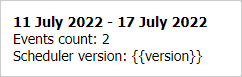
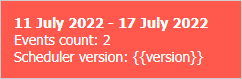
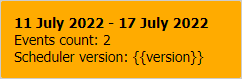
메시지 박스는 세 가지 종류가 있습니다:
- 기본 메시지 박스 (type:"info")
- 오류 메시지 박스 (type:"error")
- 경고 메시지 박스 (type:"warning")
특정 유형의 메시지 박스를 생성하려면 type 속성에 알맞은 값을 지정하세요:
// 오류 메시지 박스 생성
scheduler.message({
    text: "Click on the buttons to explore Scheduler message types",
    expire: -1,
    type: "error"
});
Related sample: Different types of popups and modal boxes
메시지 박스의 스타일을 커스터마이즈하려면 여기에서 설명한 대로 type 파라미터를 사용해 CSS 클래스를 지정할 수 있습니다.
메시지 박스 위치 지정
기본적으로 팝업 메시지 박스는 창의 오른쪽 상단에 표시됩니다. 모달 메시지 박스와 달리, 팝업 메시지는 애플리케이션과의 상호작용을 차단하지 않습니다. 위치는 scheduler.message.position 속성을 설정하여 변경할 수 있습니다:
scheduler.message.position = 'bottom';
메시지 위치로 지정할 수 있는 값은 다음과 같습니다:
- top - 메시지 박스를 오른쪽 상단에 표시 (기본값)
- bottom - 메시지 박스를 오른쪽 하단에 표시
- left - 스케줄러 아래 왼쪽에 메시지 박스 표시
- right - 스케줄러 아래 오른쪽에 메시지 박스 표시
표시 시간(Expire Interval)
expire 파라미터를 설정하여 메시지 박스가 화면에 표시되는 시간을 제어할 수 있습니다. 이 값은 메시지가 사라지기 전까지의 시간을 밀리초 단위로 지정합니다. 기본값은 4000 밀리초입니다.
이 시간을 변경하거나 메시지가 자동으로 사라지지 않게 하려면 expire를 "-1"로 설정하세요. 이 경우 메시지는 클릭해야만 닫힙니다.
scheduler.message({
    type:"error",
    text:"Invalid data format",
    expire:10000
});
API로 메시지 박스 숨기기
특정 메시지 박스를 만료되기 전에 수동으로 숨기려면 scheduler.message.hide(boxId) 메서드를 사용하세요. 파라미터는 다음과 같습니다:
- boxId - 메시지 박스를 생성할 때 할당한 ID
scheduler.message({
    id:"myBox",
    text:"Page is loaded"
});

scheduler.message.hide("myBox");
모달 메시지 박스
모달 메시지 박스는 버튼을 클릭하여 필요한 작업을 완료하기 전까지 애플리케이션과의 상호작용을 차단합니다. 버튼 클릭 시 닫히며, 지정된 콜백 함수가 실행됩니다.
모달 메시지 박스에는 세 가지 유형이 있습니다:
- Alert 메시지 박스 - 단일 버튼이 있는 경고 박스
- Confirm 메시지 박스 - 확인 또는 취소 버튼이 있는 확인 박스
- Modalbox - 여러 개의 버튼을 지원하는 모달 박스
공통 속성은 다음과 같습니다:
- id - 메시지 박스의 ID
- title - 헤더 텍스트
- type - 메시지 유형(예: warning, error)
- text - 메시지 본문 텍스트
- ok - "OK" 버튼의 텍스트
- cancel - "Cancel" 버튼의 텍스트(confirm 박스 전용)
- callback - 버튼 클릭 시 호출되는 함수, 클릭한 버튼에 따라 true 또는 false를 받음
- position - 현재 "top"만 지원; 다른 값은 박스를 중앙 정렬
- width - 모달 박스의 너비(CSS length 또는 percentage 값, 예: "100px", "50%")
- height - 모달 박스의 높이(CSS length 또는 percentage 값, 예: "100px", "50%")
Alert 메시지 박스
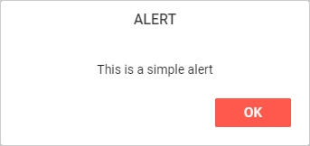
Alert 박스에는 "OK" 버튼 하나만 있습니다. 버튼 텍스트는 ok 파라미터로 지정할 수 있습니다:
- 간단한 형태(메시지 텍스트만 지정, text에 자동 할당; 다른 파라미터는 기본값 사용):
scheduler.alert("Text");
- 전체 형태(여러 파라미터 지정 가능; 지정하지 않은 값은 기본값 사용):
scheduler.alert({
    text: "some text",
    title: "Alert",
    ok: "Ok",
    callback: function(){...}
});
Confirm 메시지 박스
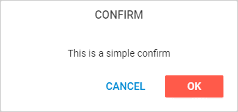
Confirm 박스에는 "OK"와 "Cancel" 두 개의 버튼이 있습니다. 각 버튼의 텍스트는 해당 속성으로 설정합니다.
- 간단한 형태
scheduler.confirm("ConfirmText");
- 전체 형태
scheduler.confirm({
    title:"Confirm",
    text:"This is a simple confirm",
    ok:"Ok",
    cancel:"Cancel",
    callback: function(result){
        if(result){
            scheduler.message("You clicked Ok");
        }else{
            scheduler.message("You clicked Cancel");
        }
    }
});
Modal Box
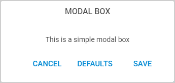
Modalbox는 다음과 같은 특징이 있습니다:
- text에 임의의 HTML 내용을 포함할 수 있습니다
- buttons 배열을 통해 여러 개의 버튼을 지원합니다. 각 버튼에 텍스트 라벨 지정
- callback 함수는 눌린 버튼의 인덱스를 파라미터로 받음
scheduler.modalbox({
    title:"Settings",
    text: " ... html code here... ",
    buttons:["Save", "Defaults", "Cancel"],
    callback: function(result){
        scheduler.alert(result);
    }
});
modalbox 버튼 구성
modalbox 버튼을 구성하는 방법은 두 가지가 있습니다:
- 간단한 형태:
scheduler.modalbox({
    // 기타 설정
    buttons:["Save", "Delete", "Cancel"],
    callback: function(result){
        switch(result){
            case "0":
                //Save
                break;
            case "1":
                //Delete
                break;
            case "2":
                //Cancel
                break;
        }
    }
});
이 형태에서는 콜백에 클릭된 버튼의 인덱스가 문자열("0", "1", "2", ...)로 전달됩니다. 각 버튼에는 라벨의 소문자를 기반으로 한 CSS 클래스가 부여됩니다. 예: scheduler_save_button, scheduler_delete_button, scheduler_cancel_button.
이 클래스들을 이용해 버튼 스타일을 지정할 수 있습니다:
.scheduler_delete_button div{
    background:red;
}
동일한 버튼 이름을 사용하는 여러 팝업에서 각기 다른 스타일이 필요하다면 type 속성을 사용할 수 있습니다:
scheduler.modalbox({
    // 기타 설정
    type:"special_popup",
    buttons:["Save", "Delete", "Cancel"]
});
type 값은 "scheduler_"로 접두어가 붙어 팝업 요소에 클래스가 추가됩니다:
.scheduler_special_popup .scheduler_delete_button div{
    background:red;
}
- 전체 형태:
버튼 라벨, CSS 클래스, 콜백 값 등을 세부적으로 지정할 수 있습니다:
scheduler.modalbox({
    // 기타 설정
    buttons: [
        { label:"Save",   css:"link_save_btn",   value:"save" },
        { label:"Cancel", css:"link_cancel_btn", value:"cancel" },
        { label:"Delete", css:"link_delete_btn", value:"delete" }
    ],
    callback: function(result){
        switch(result){
            case "save":
                //Save
                break;
            case "cancel":
                //Cancel
                break;
            case "delete":
                //Delete
                break;
        }
    }
});
label 파라미터만 필수이며, css와 value는 선택입니다. 생략하면 CSS 클래스는 라벨의 소문자 값에서 파생되고, 버튼 인덱스가 값으로 사용됩니다.
css 클래스는 "scheduler_"로 접두어가 붙어 버튼 요소에 적용됩니다:
.scheduler_link_delete_btn div{
    background:red;
}
모달 메시지 박스 숨기기
모달 메시지 박스를 수동으로 닫으려면, 해당 모달박스의 컨테이너 엘리먼트를 scheduler.modalbox.hide() 메서드에 전달하세요:
var box = scheduler.modalbox({
    title: "Settings",
    text: " ... html code here... ",
    buttons: ["Save", "Defaults", "Cancel"],
    callback: function(result){
        scheduler.alert(result);
    }
});

scheduler.modalbox.hide(box);
alert 및 confirm 박스도 동일하게 scheduler.modalbox.hide() 메서드를 사용합니다:
var box = scheduler.confirm({
    text: "Continue?",
    ok:"Yes",
    cancel:"No",
    callback: function(result){
        scheduler.message("Result: "+result);
    }
});

scheduler.modalbox.hide(box);
스타일링
CSS 스타일을 정의하여 메시지 박스의 외형을 커스터마이즈할 수 있습니다. 일반적으로 type 파라미터로 CSS 클래스를 지정합니다.
'type' 파라미터 사용 시 주의 사항:
- alert 및 confirm 박스를 스타일링하려면 'window-related' 메서드로 초기화하세요.
- 메시지 박스를 스타일링하려면 'common' 메서드로 초기화하세요.
- CSS 클래스 이름은 'scheduler-'로 시작해야 합니다.
- 스타일을 올바르게 적용하려면 .scheduler-some div와 같은 선택자를 사용해 scheduler 메시지 내부 요소를 타겟팅하세요.
예시:
<style type="text/css">
.scheduler-myCss div{
    font-weight:bold;
    color:wheat;
    background-color:crimson;
}
</style>


scheduler.message({ type:"myCss", text:"some text" });
모달 창과 키보드 상호작용
모달 박스의 키보드 동작은 scheduler.message.keyboard 속성으로 제어하며, 기본값은 true입니다.
활성화되어 있을 때, 모달 박스는 페이지의 대부분 키보드 이벤트를 차단합니다. 활성화된 키는 다음과 같습니다:
- "space" 및 "enter" - 모달 박스에서 true 결과를 발생시킴
- "escape" - false 결과를 발생시킴
scheduler.message.keyboard를 false로 설정하면 이 차단이 해제되어, 모달 박스 내에서 데이터 입력 등 일반적인 키보드 입력이 가능합니다:
scheduler.message.keyboard = false;
scheduler.modalbox({...});
이렇게 하면 모달 창 내에서 일반적인 키보드 사용이 가능합니다.
맨 위로