Tooltips
If you use dhtmlxScheduler 6.0 or earlier, see details here.
To display tooltips for events, you should activate the Tooltip extension once on the page.
scheduler.plugins({
    tooltip: true
});
After that tooltips will be displayed with the default settings.
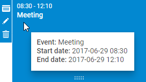
Once the extension is activated, tooltips will be automatically displayed with the default settings.
Custom text
By default, tooltips display 3 properties of an event:
- The start date of an event.
- The end date of an event.
- The event text.
To set a custom text for tooltips, use the tooltip_text template:
scheduler.templates.tooltip_text = function(start,end,event) {
    return "<b>Event:</b> "+event.text+"

<b>Start date:</b> "+
    scheduler.templates.tooltip_date_format(start)+"

"+
    "<b>End date:</b> "+scheduler.templates.tooltip_date_format(end);
};
Tooltip API
Tooltip object
You can access the object of tooltip as scheduler.ext.tooltips.tooltip. This object allows manipulating the position, content and visibility of tooltip via a set of methods:
- getNode() - returns the HTML element of the tooltip
- setViewport() - locks the position of the tooltip to the boundaries of the specified HTML element
- node - (HTMLElement) the HTML element in question
- show() - displays the tooltip at specific coordinates (relative to document.body). The method can take different parameters, depending on the position your want to show the tooltip at:
- To display the tooltip at specific coordinates (relative to document.body), pass:
- left - (number) the X coordinate
- top - (number) the Y coordinate
- To display tooltip at the mouse event coordinates (tooltip_offset_x/y and viewport will be taken into account), pass:
- event - (Event) the mouse event object
- To display the tooltip at specific coordinates (relative to document.body), pass:
- hide() - hides the tooltip element
- setContent()- puts HTML content into the tooltip. Takes as a parameter:
- html - (string) a string with HTML content for the tooltip
Methods
There are several methods that allow controlling behavior of the tooltip while hovering over DOM elements.
scheduler.ext.tooltips.attach()
adds a tooltip with an extended configuration. The method takes an object with the tooltip settings as a parameter. The settings that can be adjusted via the method are the following:
- selector - (string) defines a CSS-selector for the elements to listen to mouse events on
- onmouseenter - (function) a handler called when the mouse pointer enters the element. The parameters are:
- event - (Event) the native mouse event
- node - (HTMLElement) the HTML node
- onmousemove - (function) a handler called when the mouse pointer moves inside the element. The parameters are:
- event - (Event) the native mouse event
- node - (HTMLElement) the HTML node
- onmouseleave - (function) a handler called when the mouse pointer leaves the element. The parameters are:
- event - (Event) the native mouse event
- node - (HTMLElement) the HTML node
- global - (boolean) defines whether the module listens to the mouse events on the whole page (true) or only inside a scheduler element (false). By default the option is set to false.
scheduler.ext.tooltips.tooltipFor()
adds a tooltip for the specified Scheduler element. It is a more simplified version of the attach() method. The method takes as a parameter an object with the tooltip details. This object has the following properties:
- selector - (string) the CSS-selector of the Scheduler element to add a tooltip to
- html - (function) a template for the tooltip. The template function takes two parameters in its turn:
- event - (Event) the native mouse event
- node - (HTMLElement) the HTML node and returns a string with a template.
- global - (boolean) optional, defines whether the module listens to the mouse events on the whole page (true) or only inside a scheduler element (false). By default the option is set to false.
scheduler.ext.tooltips.detach()
removes a tooltip. As a parameter the method takes:
- selector - (string) the CSS selector of a Scheduler element
Tooltips for different elements
By default, tooltips are added just to the Scheduler events, but you can also set tooltips for any other Scheduler element.
There are two corresponding methods in the tooltip API for this purpose:
- the scheduler.ext.tooltips.tooltipFor() method
Note, the scheduler.ext.tooltips.tooltipFor() method must be called after the Scheduler initialization is complete. For instance, you can specify the method inside the onSchedulerReady event handler like this:
scheduler.attachEvent("onSchedulerReady", function(){
    scheduler.ext.tooltips.tooltipFor({
        selector: ".dhx_matrix_scell",
        html: function (event, node) {
            const sectionId = scheduler.getActionData(event).section;
            const timeline = scheduler.getView("timeline");
            var section = timeline.y_unit[timeline.order[sectionId]];
            return `Tooltip for <b>${section.label}</b>`;
        }
    });
});
Or you can use the following way:
scheduler.init("scheduler_here");

scheduler.ext.tooltips.tooltipFor({
    selector: ".dhx_matrix_scell",
    html: function (event, node) {
        const sectionId = scheduler.getActionData(event).section;
        const timeline = scheduler.getView("timeline");
        var section = timeline.y_unit[timeline.order[sectionId]];
        return `Tooltip for <b>${section.label}</b>`;
    }
});
A tooltip added in this way will follow the mouse pointer and use the tooltip_offset_x, tooltip_offset_y, tooltip_timeout, and tooltip_hide_timeout settings.
- the scheduler.ext.tooltips.attach() method
This method allows adding a tooltip with an extended configuration to adjust the tooltip behavior to the movement of the mouse pointer.
Customization of tooltip behavior
There is a possibility to modify the default behavior of the tooltip. It can be achieved by removing the default tooltip handler and adding a custom one. Follow the steps below:
- Remove the built-in tooltip handler from tasks with the scheduler.ext.tooltips.detach method:
// remove the built-in tooltip handler from tasks
scheduler.ext.tooltips.detach(`[${scheduler.config.event_attribute}]`);
- Add the desired tooltip behavior via the scheduler.ext.tooltips.attach() method. In the example below the tooltip is shown only above the table:
scheduler.ext.tooltips.tooltipFor({
  selector: `[${scheduler.config.event_attribute}]`,
  html: (event: MouseEvent) => {
     if (scheduler.config.touch && !scheduler.config.touch_tooltip) {
     return;
   }

   const evNode = event.target.closest(`[${scheduler.config.event_attribute}]`);
   const evId = evNode.getAttribute(scheduler.config.event_attribute);
   if(scheduler.getEvent(evId)){
     const ev = scheduler.getEvent(evId);
     return scheduler.templates.tooltip_text(ev.start_date, ev.end_date, ev);
   }
   return null;
  },
  global: false
});
Timeout
You can configure the time of tooltips showing and hiding via the related settings.
To specify the time period (in milliseconds) before a tooltip for a task will appear, use the tooltip_timeout property:
scheduler.config.tooltip_timeout = 50;
scheduler.init("scheduler_here");
To define how long (in milliseconds) a tooltip will be shown after the user moves the cursor to another position, use the tooltip_hide_timeout property:
scheduler.config.tooltip_hide_timeout = 5000;
scheduler.init("scheduler_here");
Position
The position of a tooltip can be configured by changing the offsets of its default position via the two configuration properties:
- tooltip_offset_x - sets the horizontal offset of the tooltip position
- tooltip_offset_y - sets the vertical offset of the tooltip position
scheduler.config.tooltip_offset_x = 30;
scheduler.config.tooltip_offset_y = 40;

scheduler.init("scheduler_here");
Displaying area
By default tooltips are attached to document.body. If necessary, you can limit showing of tooltips to the container before initialization of Scheduler by using the code below:
scheduler.attachEvent("onSchedulerReady", function(){
    var tooltips = scheduler.ext.tooltips;
     tooltips.tooltip.setViewport(container);
});

scheduler.init("scheduler_here");