CSS 文档
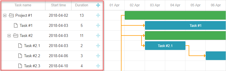
本文介绍如何通过自定义样式覆盖 Gantt 图元素的默认颜色设置。内容涵盖了用于为 Gantt 图各部分设置样式的主要类选择器和模板,包括 表格区域(Grid area)、时间轴区域(Timeline area) 和 资源面板(Resource panel)。
表格区域样式(Styling Grid)
本节介绍用于为 表格区域 主要元素设置样式的 CSS 选择器。
表格元素的 DOM 结构如下:
- .gantt_grid
    - .gantt_grid_scale
        - .gantt_grid_head_cell
    - .gantt_grid_data
        - .gantt_row.odd
        - .gantt_row
        - .gantt_row.gantt_row_task
        - .gantt_row.gantt_row_project
        - .gantt_row.gantt_row_milestone
            - gantt_cell.gantt_cell_tree
                - .gantt_tree_indent
                - .gantt_tree_icon.gantt_close
                - .gantt_tree_icon.gantt_open
                - .gantt_tree_content
            - gantt_cell
                - .gantt_tree_content
表格头部(Grid header)
可以使用 .gantt_grid_scale 类选择器自定义表格头部的样式。
以下示例为表格和时间轴的头部设置统一的背景和字体颜色:
.gantt_grid_scale, .gantt_task_scale, .gantt_task_vscroll {
    background-color: #eee;
}
.gantt_grid_scale, .gantt_task_scale,
.gantt_task .gantt_task_scale .gantt_scale_cell,
.gantt_grid_scale .gantt_grid_head_cell {
    color: #000;
    font-size: 12px;
    border-bottom: 1px solid #cecece;
}
Related sample: Styling grid and timeline headers
标尺高度(Scale height)
请避免通过 CSS 更改表格头部和时间标尺的高度。
建议通过 Gantt 的 scale_height 配置属性设置标尺高度:
gantt.config.scale_height = 50;
表格头部单元格
要为表格头部的单元格设置样式,请使用 .gantt_grid_head_cell 选择器。
可用于定位单元格的选择器包括:
- .gantt_grid_head_cell[data-column-id='columnName'] — 选中特定列的单元格;
其中 columnName 应对应于 column 的 name 属性:
<style>
    .gantt_grid_head_cell[data-column-id='columnName'] {
        background-color: #ededed;
        color:black;
    }
</style>
gantt.config.columns = [
    ...
    {name: "columnName", align: "center"},
    ...
];
Related sample: Styling a particular cell in the grid header
.gantt_grid_head_cell[data-column-index='1'] — 通过索引选中列;
.gantt_grid_head_cell[data-column-name='start_date'] — 通过名称选中列。
表格主体(Grid body)
可以通过对 .gantt_grid_data 应用 CSS 样式自定义表格主体的颜色。
表格行样式
可以通过 .gantt_row 选择器更改表格行的样式。
间隔行(Every other row)
要设置交替行的样式,可将 CSS 应用于 .gantt_row.odd 选择器,例如:
.gantt_row.odd{
    background-color:#f4f4fb;
}
Related sample: Styling every other row in grid
虽然界面上高亮的是偶数行,但样式实际应用于索引为奇数(1, 3, 5 等)的行,具体请参见 row indexes。
选中行(Selected row)
要设置表格中选中行的样式,请使用 .gantt_row.gantt_selected 选择器:
.gantt_grid_data .gantt_row.gantt_selected,
.gantt_grid_data .gantt_row.odd.gantt_selected,
.gantt_task_row.gantt_selected {
    background-color: #fff3a1;
}
Related sample: Styling selected row
任务行、项目行和里程碑行
用于表示任务、项目或里程碑的行可以通过以下选择器设置样式:
- .gantt_row.gantt_row_task
- .gantt_row.gantt_row_project
- .gantt_row.gantt_row_milestone
例如:
.gantt_row.gantt_row_project{
   background-color:#fafafa;
   font-weight: bold;
}
Related sample: Styling rows of project tasks
特定行(Particular rows)
要为特定行添加自定义类,请使用 grid_row_class 模板,如下所示:
<style>
    .highlighted_task.gantt_row {
        background-color: #ff9668;
        border-color: rgba(0,0,0,0.3);
    }
</style>
gantt.templates.grid_row_class = function(start, end, task){
    if(task.highlight){
        return "highlighted_task";     }
    return "";
};
Related sample: Styling a particular row in the grid
行高(Row height)
可以通过设置 row_height 配置项调整行高:
gantt.config.row_height = 40;
或为任务指定 row_height 属性:
{ id: 2, text: "Task #1", start_date: "02-04-2018",
    duration: 8, row_height:40, parent: 1 },
请避免通过 CSS 更改行高,以免导致布局异常。
表格单元格/列样式
可以通过 .gantt_row .gantt_cell 设置表格的单元格或列的样式。
要为特定列设置样式,可使用:
- .gantt_row .gantt_cell[data-column-name='columnName'] — 按列名定位,例如:
.gantt_grid_head_cell[data-column-id='start_date'],
.gantt_row .gantt_cell[data-column-name='start_date'] {
    background-color: #ededed;
    color:black;
}
Related sample: Styling a column in grid
注意,.gantt_grid_head_cell 和 .gantt_cell 使用的数据属性不同,分别为 data-column-id 和 data-column-name。此不一致将在未来版本中修正。
- 或使用 .gantt_row .gantt_cell[data-column-index='1'] 按索引定位列。
时间轴区域样式(Styling Timeline)
本节介绍可用于自定义 时间轴区域 元素默认样式的 CSS 选择器。
时间轴区域的 DOM 结构如下:
- .gantt_task
    - .gantt_task_scale
        - .gantt_scale_line
            - .gantt_scale_cell
    - .gantt_data_area
        - .gantt_task_bg
            - .gantt_task_row
            - .gantt_task_row.odd
                - .gantt_task_cell
        - .gantt_links_area
            - .gantt_task_link
        - .gantt_bars_area
            - .gantt_task_line
                - .gantt_task_progress_wrapper
                    - .gantt_task_progress
                - .gantt_task_progress_drag
                - .gantt_task_content
                - .gantt_task_drag.task_start_date
                - .gantt_task_drag.task_end_date
                - .gantt_link_control.task_start_date
                - .gantt_link_control.task_end_date
                    - .gantt_link_point
        - div - custom layers
时间标尺(Time scale)
时间标尺的 DOM 结构为:
- .gantt_task_scale
    - .gantt_scale_line
        - .gantt_scale_cell
时间标尺容器
.gantt_task_scale 选择器用于定位时间标尺的容器。
例如,修改时间标尺的字体颜色和边框:
.gantt_grid_scale, .gantt_task_scale {
    border-bottom: 1px solid #0e0e0e;
}

.gantt_task .gantt_task_scale .gantt_scale_cell {
    color: #000;
}
.gantt_grid_scale .gantt_grid_head_cell {
    color: #000;
}
Related sample: Styling text and borders of the time scale
时间标尺行
使用 .gantt_scale_line 选择器为整个时间标尺行设置样式。要按位置定位特定时间标尺行,可用 .gantt_scale_line:nth-child(n)。
例如,为不同标尺设置背景色:
.gantt_scale_line:nth-child(1){
    font-weight:bold;
    background-color:#eee;
}
.gantt_scale_line:nth-child(2){
    background-color:#fff;
}
Related sample: Background color of the time scale
默认情况下,没有针对标尺单位的 CSS 类,但可以通过 scale_row_class 模板添加:
如下为 month、week 和 day 标尺添加样式:
<style>
    .gantt_scale_line.month_scale{
        font-weight:bold;
        background-color:#ddd;
    }
    .gantt_scale_line.week_scale{
        background-color:#e1e1e1;
    }

    .gantt_scale_line.day_scale{
        background-color:#efefef;
    }
</style>
gantt.templates.scale_row_class = function(scale){
    return scale.unit + "_scale";
};
Related sample: Styling different time scales
时间标尺单元格
可通过 .gantt_scale_cell 选择器为时间标尺的单元格设置样式。
例如更改字体颜色和边框:
.gantt_task .gantt_task_scale .gantt_scale_cell {
    color: #a6a6a6;
    border-right: 1px solid #ebebeb;
}
Related sample: Styling text and borders of the scale cells
要在时间标尺上高亮特定日期,可通过 gantt.config.scales 对象的 css 属性实现:
gantt.config.scales = [
    {unit: "month", step: 1, format: "%Y %M"},
    {unit: "day", step: 1, format: "%l, %F %d", css: function(date){
        if(!gantt.isWorkTime({date: date, unit: "day"})){
            return "weekend";
        }
        return "";
    }}
];
<style>
    .gantt_scale_cell.weekend {
        background-color: #F5F5F5;
    }
</style>
Related sample: Duration includes only working days
如果想为整列着色,请使用后文介绍的 timeline_cell_class 模板。
数据区域(Data area)
数据区域的 DOM 结构如下:
- .gantt_data_area
    - .gantt_task_bg
        - .gantt_task_row
        - .gantt_task_row.odd
            - .gantt_task_cell
    - .gantt_links_area
        - .gantt_task_link
    - .gantt_bars_area
        - .gantt_task_line
            - .gantt_task_progress_wrapper
                - .gantt_task_progress
            - .gantt_task_progress_drag
            - .gantt_task_content
            - .gantt_task_drag.task_start_date
            - .gantt_task_drag.task_end_date
            - .gantt_link_control.task_start_date
            - .gantt_link_control.task_end_date
                - .gantt_link_point
    - div - custom layers
任务(Task)
任务条
要自定义任务条的外观,请在 .gantt_task_line 选择器中定义自己的样式。
以下示例更改了任务条的边框样式:
.gantt_task_line {
    border-radius: 14px;
}
Related sample: Styling borders of the task bars
如需调整任务条的颜色,请按照以下两个步骤操作:
- 重写边框和进度条的样式,使其颜色与任务条应用的自定义颜色保持一致:
.gantt_task_line{
    border-color: rgba(0, 0, 0, 0.25); /* 黑色,透明度25% */
}
.gantt_task_line .gantt_task_progress {
    background-color: rgba(0, 0, 0, 0.25);
}
- 设置任务条及其内容的期望颜色:
.gantt_task_line{
    background-color: #03A9F4;
}
.gantt_task_line.gantt_task_content {
    color: #fff;
}
关于如何为不同颜色的任务条应用匹配的边框和进度条颜色的示例,请参阅 Task Coloring 文章。
如果要为 任务、项目 或 里程碑 的行着色,请为相应的类选择器添加自定义 CSS:
- .gantt_task_line.gantt_bar_task
- .gantt_task_line.gantt_bar_project
- .gantt_task_line.gantt_bar_milestone
以下是选中任务条的样式示例:
.gantt_task_line.gantt_selected {
    box-shadow: 0 2px 5px #000;
}

.gantt_task_line.gantt_bar_project.gantt_selected {
    box-shadow: 0 2px 5px #000;
}
Related sample: Styling selected bar
自定义类型 的任务会获得反映该类型的类名:
{
    id: 2, text: "Task #1", start_date: "02-04-2018", duration: 8,
    type:"custom_type", parent: 1 },
这对应于选择器 .gantt_task_line.gantt_bar_custom_type。
拆分任务
拆分任务 是父项的子任务。浅绿色的背景条表示父项的任务条,其样式不同。
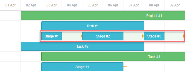
Related sample: Expand and collapse split tasks
如果你打开该示例并展开“Task #2”,你会注意到“Task #2”汇总项的绿色条。
当拆分任务显示在同一行时,这个绿色条会保持在相同位置,但透明度和 z-index 会有所调整。
你可以像为 时间线 中的其他任务条一样为其设置样式,或者通过以下 CSS 完全隐藏它:
.gantt_task_line.gantt_split_parent {
    display: none;
}
当只有一个拆分任务时,汇总项(type=“project”)会变得不可见,因为它被拆分任务完全覆盖。如果没有拆分子任务,汇总项会保留默认的日期和持续时间。
进度条
使用以下选择器为进度条设置样式:
- .gantt_task_progress — 更改进度条的填充颜色;
- .gantt_task_progress_drag — 为进度条的拖拽手柄设置样式。
以下是使用 CSS 自定义任务和进度条的示例:
- 更改背景、文本和进度颜色:
/* 任务条 */

/* 任务条的背景色 */
.gantt_task_line {
    background-color: #3db9d3;
    border: 1px solid #2898b0;
}

/* 文本颜色 */
.gantt_task_line .gantt_task_content {
    color: #fff;
}

/* 进度条填充 */
.gantt_task_progress {
    background: #299cb4;
}
- 项目(汇总)条的样式:
/* 项目 */
/* 项目条的背景色 */
.gantt_task_line.gantt_bar_project {
    background-color: #65c16f;
    border: 1px solid #3c9445;
}

/* 项目条的进度 */
.gantt_task_line.gantt_bar_project .gantt_task_progress {
    background-color: #46ad51;
}
- 里程碑条的样式:
/* 里程碑 */
.gantt_task_line.gantt_milestone {
    background-color: #d33daf;
    border: 0 solid #61164f;
}
Related sample: Background, foreground, and progress colors. Styling Project and Milestone bars.
为特定任务条自定义颜色
要为特定任务条分配颜色,请通过 gantt.templates.task_class 模板添加自定义类:
gantt.templates.task_class = function(start, end, task){
    if(task.highlight){
        return "highlighted_task";
    }
    return "";
};
然后在 CSS 中为该类设置样式:
.highlighted_task.gantt_task_line {
    background-color: #ff9668;
    border-color: rgba(0,0,0,0.3);
}
.highlighted_task .gantt_task_progress {
    text-align: center;
    z-index: 0;
    background: rgba(0,0,0,0.3);
}
Related sample: Styling particular task bars
高亮任务条内部区域
如需高亮任务条内的特定区域,可通过 gantt.templates.task_text 模板在任务条中插入额外元素:
gantt.templates.task_text = function(start, end, task){
    return '<div class="custom_progress warm_up" style="width:20%"></div>' +
      '<div class="custom_progress in_progress" style="width:60%">'+task.text+'</div>'
      '<div class="custom_progress cool_down" style="width:20%"></div>';
};
然后为这些元素定义样式:
.custom_progress {
    display: inline-block;
    vertical-align: top;
    text-align: center;
    height: 100%;
}

.custom_progress.nearly_done {
    background-color: #4CC259;
}

.custom_progress.in_progress {
    background-color: #88BFF5;
}

.custom_progress.idle {
    background-color: #d96c49;
}
Related sample: Custom html content (Stackbar)
链接
链接的 DOM 结构如下:
- .gantt_task_link
    - .gantt_line_wrapper
    - .gantt_link_line_right
    - .gantt_link_line_left
    - .gantt_link_line_up
    - .gantt_link_line_down
- .gantt_link_arrow.gantt_link_arrow_right
- .gantt_link_arrow.gantt_link_arrow_left
以下是为依赖关系链接元素着色的示例:
.gantt_line_wrapper div {
    background-color: #ffa011;
}
.gantt_link_arrow_right {
    border-left-color: #ffa011;
}
.gantt_link_arrow_left {
    border-right-color: #ffa011;
}
.gantt_task_link:hover .gantt_line_wrapper div {
    box-shadow: 0 0 5px 0 #ffa011;
}
链接线的粗细由 gantt.config.link_line_width 设置控制。
调整器
以下选择器用于定位调整器元素:
- .gantt_task_drag
- .gantt_task_drag.task_start_date
- .gantt_task_drag.task_end_date
如需禁用开始日期的调整器,请使用:
.gantt_task_line:hover .gantt_task_drag.task_start_date{
    display: none;
}
Related sample: Disabling resizer of the start date
如需禁用结束日期的调整器,请使用:
.gantt_task_line:hover .gantt_task_drag.task_end_date{
    display: none;
}
Related sample: Disabling resizer of the end date
链接控制
使用以下选择器为任务起始或结束处的圆形手柄元素设置样式:
- .gantt_link_control .gantt_link_point
- .gantt_link_control.task_start_date .gantt_link_point
- .gantt_link_control.task_end_date .gantt_link_point
背景网格
背景网格的 DOM 结构如下:
- .gantt_data_area
    - .gantt_task_bg
        - .gantt_task_row
        - .gantt_task_row.odd
            - .gantt_task_cell
背景行:
要自定义背景行的默认样式,请在 .gantt_task_row 选择器中添加自己的样式。例如:
.gantt_row,
.gantt_task_row {
    border-bottom: 1px solid #ebebeb;
    background-color: #fff;
}
如需为每隔一行设置不同的背景色,请在 .gantt_task_row.odd 选择器中定义自定义样式。
你也可以这样为选中的行指定样式:
.gantt_grid_data .gantt_row.gantt_selected,
.gantt_grid_data .gantt_row.odd.gantt_selected,
.gantt_task_row.gantt_selected {
    background-color: #fff3a1;
}
.gantt_task_row.gantt_selected .gantt_task_cell{
    border-right-color: #ffec6e;
}
Related sample: Styling selected row
背景单元格
要调整背景单元格的默认样式,请使用 .gantt_task_cell 选择器定义自定义样式。
如果要为背景列着色,可以使用 timeline_cell_class 模板:
gantt.templates.timeline_cell_class = function (task, date) {
    if(!gantt.isWorkTime({date: date, unit: "day", task: task})){
        return "weekend";
    }
    return "";
};
然后应用以下 CSS:
.gantt_task_cell.weekend {
    background-color: #F5F5F5;
}

.gantt_task_row.gantt_selected .gantt_task_cell.weekend {
    background-color: #F8EC9C;
}
Related sample: Duration includes only working days
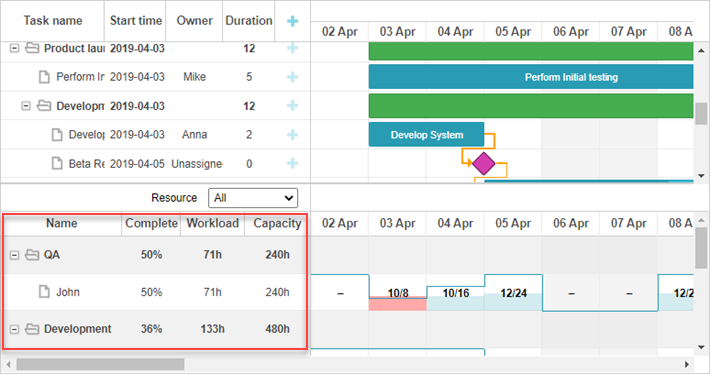
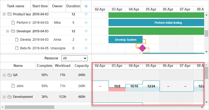
资源面板
资源面板 包含与主甘特区域类似的表格和时间线。
默认情况下,资源视图的表格和时间线将使用全局模板和配置。可以通过在 layout config 中传递不同的模板和配置,专门为资源面板分配不同的模板和配置。
要为资源表格和时间线设置样式,请使用针对相应视图名称的 CSS 选择器:
.resourceGrid_cell .gantt_row,
.resourceHistogram_cell .gantt_task_row {
    border-bottom: 1px solid #ebebeb;
    background-color: #fff;
}
资源面板的 DOM 结构如下:
- .gantt_layout_root
    - .grid_cell
    - .timeline_cell
    - .resourceGrid_cell
    - .resourceHistogram_cell
    - .resourceTimeline_cell
.gantt_layout_root 下的类名对应于布局配置中的 view 属性值:
gantt.config.layout = {
    css: "gantt_container",
    rows: [
        {
            cols: [
                {view: "grid", group:"grids", scrollY: "scrollVer"},                 ...
            ]
        },
        ...
        {
            id: "resources",
            cols: [
                { view: "resourceGrid", group:"grids", scrollY: "resourceVScroll" },                 ...
                { view: "resourceHistogram", capacity:24, scrollX: "scrollHor",                      scrollY: "resourceVScroll" },
                ...
            ]
        },
        ...
    ]
};
资源表格
资源表格使用与任务表格相同的选择器,顶级选择器为 .resourceGrid_cell:
.resourceGrid_cell .gantt_row,
.resourceGrid_cell .gantt_row.odd{
    background-color: rgba(232, 232, 232, 0.6);
}
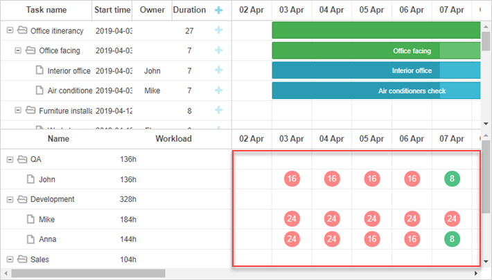
资源直方图
资源直方图与主时间线共享元素。默认情况下,针对主时间线的选择器也适用于资源时间线,除非选择器指定了布局单元格类,如 .timeline_cell 或 .resourceHistogram_cell。
如果需要专门针对资源直方图进行样式设置,请使用 .resourceHistogram_cell 选择器。
资源直方图的 DOM 结构包括:
- .gantt_task_bg
- .gantt_bars_area
    - div
        - .gantt_histogram_fill
        - .gantt_histogram_cell
    - div
        - .gantt_histogram_hor_bar
        - .gantt_histogram_vert_bar
以下是直方图元素样式的示例:
.gantt_histogram_cell {
    color: #000;
}

.gantt_histogram_label {
    font-weight: 700;
    font-size: 13px;
}

.gantt_histogram_fill {
    background-color: rgba(41,157,180,.2);
}
如需为特定单元格设置样式,请使用 gantt.templates.histogram_cell_class 模板:
gantt.templates.histogram_cell_class = function(start_date,end_date,resource,tasks) {
    if (getAllocatedValue(tasks, resource) > getCapacity(start_date, resource)) {
        return "column_overload"
    }
};
应用 CSS 以高亮显示这些单元格:
.column_overload .gantt_histogram_fill {
    background-color: #ffa9a9;
}
如需自定义直方图线条样式,可对以下选择器应用 CSS:
- .gantt_histogram_hor_bar
- .gantt_histogram_vert_bar
例如,可以通过如下方式更改其颜色:
.gantt_histogram_hor_bar, .gantt_histogram_vert_bar {
    background: #299db4;
}
资源图表
资源图表与主时间线使用相同的元素。默认情况下,针对主时间线的选择器也会应用于此处,除非通过如 .timeline_cell 或 .resourceTimeline_cell 这样的布局单元格类进行限定。
可以使用 .resourceTimeline_cell 选择器专门针对资源图表进行样式设置。
资源图表的 DOM 结构包括:
- .gantt_task_bg
- .gantt_bars_area
    - div
        - .gantt_resource_marker
            - div
顶级选择器为 .resourceTimeline_cell。
以下是资源图表标签的样式示例:
.gantt_resource_marker div {
    background: #51c185;
    width: 28px;
    height: 28px;
    line-height: 29px;
    display: inline-block;
    color: #FFF;
    margin: 3px;
}
如需为特定标记自定义样式,可以使用 gantt.templates.resource_cell_class 模板:
<style>
    .resource_marker.workday_over div {
        border-radius: 3px;
        background: #ff8686;
    }
gantt.templates.resource_cell_class = function(start_date, end_date, resource, tasks){
    var css = [];
    css.push("resource_marker");
    if (tasks.length <= 1) {
        css.push("workday_ok");
    } else {
        css.push("workday_over");
    }
    return css.join(" ");
};