Mobile Responsive Scheduler
dhtmlxScheduler provides support for touch devices, such as:
- iOS devices (iPad, iPhone, iPod);
- Windows-based tablets and touch screen monitors;
- Android-based devices.
The scheduler will work on smartphones as well, but due to the lack of screen space it will require manual configuration.
Important tips!
- Touch support is enabled by default and provided in all modes of the scheduler.
- If your app is intended to be used on the touch devices, we strongly recommend to use the 'material' skin, as it provides reasonably big and easy-to-touch buttons.
- Usually it is a good idea to use a Quick Info if you expect mobile users
- We recommend adding the meta tag below on the page. It will automatically make all elements of the scheduler larger, which will make it so much easier for the end users
<meta name="viewport" content="width="device-width," initial-scale="1""/>
Responsive layout
When you initialize Scheduler via the header configuration property, you'll be able to choose the header structure that fits the screen size of the client. It will also apply certain styles which will make elements and font sizes responsive on small screens.
Header
For example, you can rearrange the header into multiple rows:
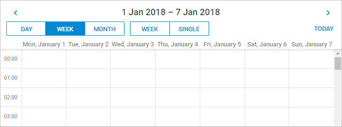
In the image above Scheduler is displayed on a small screen.
This setting can be changed dynamically, which allows you to define separate header configurations both for large and small screens:
// define configs
const compactHeader = {
    rows: [
        {
            cols: [
                "prev",
                "date",
                "next",
            ]
        },
        {
            cols: [
                "day",
                "week",
                "month",
                "spacer",
                "today"
            ]
        }
    ]
};

const fullHeader = [
    "day",
    "week",
    "month",
    "date",
    "prev",
    "today",
    "next"
];

// add a switch to select an appropriate config for a current screen size

function resetConfig(){
    let header;
    if (window.innerWidth < 1000) {
        header = compactHeader;
    } else {
        header = fullHeader;

    }
    scheduler.config.header = header;
    return true;
}

// apply the config initially and each time scheduler repaints or resizes:

resetConfig();
scheduler.attachEvent("onBeforeViewChange", resetConfig);
scheduler.attachEvent("onSchedulerResize", resetConfig);

scheduler.config.responsive_lightbox = true; // responsive lightbox

scheduler.init("scheduler_here");
Lightbox
Scheduler API provides the responsive_lightbox configuration option that enables responsiveness of the lightbox.
scheduler.config.responsive_lightbox = true; //disabled by default
//you need to set this value to true to enable the responsiveness of the lightbox
The elements of the lightbox adapt to a small screen in the image below:
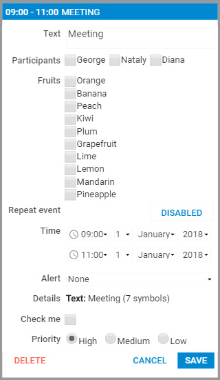
There is a possibility to customize the lightbox appearance when it is responsive. The lightbox will have an additional CSS class dhx_cal_light_responsive which you can use in your selectors.
By default, this class has some media queries associated with it. These new styles will have effect only on smaller screen/window sizes (< 1024px) and can change look and feel of the lightbox on these screens.
Touch configuration options
Here is a list of configuration options related to the mobile/responsive support:
- header - specifies the header layout
- touch - enables/disables touch support in the scheduler
- touch_drag - defines the time period (in milliseconds) that is used to differentiate a long touch gesture from a scroll gesture
- touch_tip - enables/disables prompting messages in the right top corner of the screen
- touch_swipe_dates - enables/disables prompting messages in the right top corner of the screen
- responsive_lightbox - enables responsive styles for the lightbox (disabled by default)
Touch gestures in the scheduler
- Double tap - works the same as a double click in the normal scheduler (triggers event edition or creation);
- Long tap and drag - moves or creates events;
- Swipe - switches view to the next|prev time span (disabled by default).
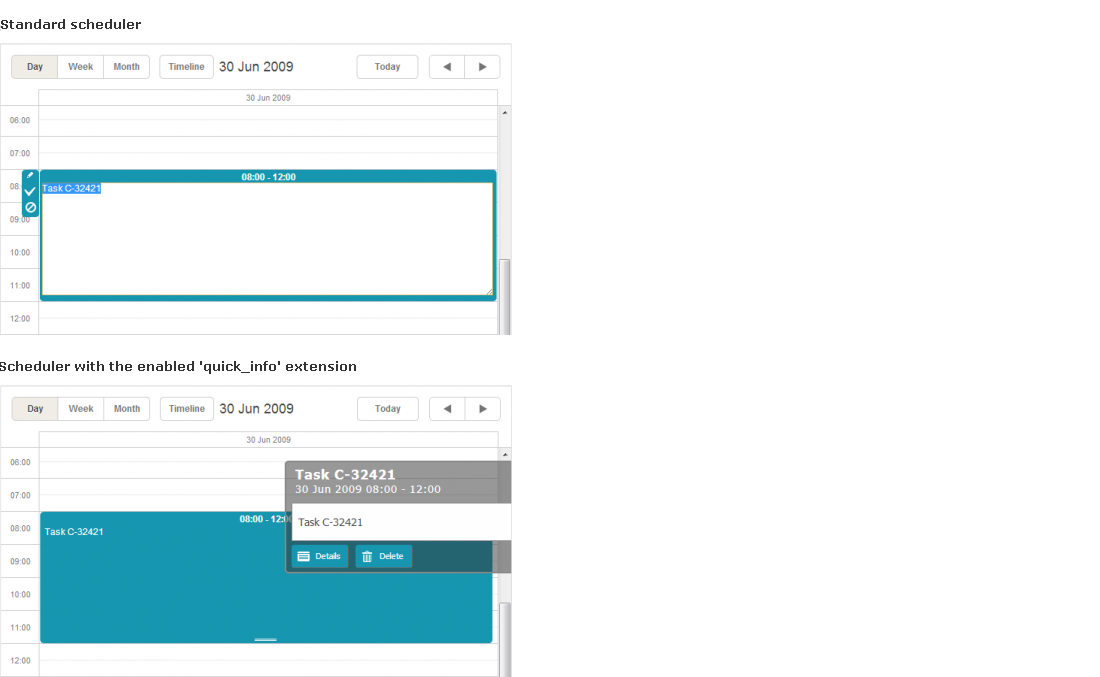
'Quick info' extension
Specially for providing touch functionality, the library is extended with the "Quick Info" extension.
The extension allows you to replace the standard sidebar buttons and the simplified edit form (which are quite small and hard-to-target on touch devices) with new ones, bigger and handier.
To activate the big-buttons scheduler, include the "Quick Info" extension on the page:
<script>
    scheduler.plugins({
        quick_info: true
    });
    scheduler.init('scheduler_here',new Date(2019,5,30),"day");
      ...
<script>
Once the extension is enabled, the scheduler automatically replaces standard buttons with large-size ones:
Note, the quick-info selection side menu and selection menu in the standard scheduler use the same configuration that is stored in the icons_select object.
The extension provides:
-
3 templates
-
quick_info_content - specifies the content of the pop-up edit form
-
quick_info_date - specifies the date of the pop-up edit form
-
quick_info_title - specifies the title of the pop-up edit form
-
1 configuration option
-
quick_info_detached - defines whether the event form will appear from the left/right side of the screen or near the selected event
-
2 methods
-
hideQuickInfo - hides the pop-up event form (if it's currently active)
-
showQuickInfo - displays the pop-up event form for the specified event
-
2 events
-
onQuickInfo - fires when the pop-up edit form appears
-
onAfterQuickInfo - fires after the pop-up event form is closed