Lightbox Controls
Lightbox is an edit form used to alter the event's details. The default lightbox is presented in the image below.
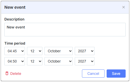
Lightbox Structure
Sections
The structure of the lightbox is specified by the sections property of the lightbox object:
//default lightbox definition
scheduler.config.lightbox.sections = [
    {name:"description", height:200, map_to:"text", type:"textarea" , focus:true},
    {name:"time", height:72, type:"time", map_to:"auto"}
];
Each element of the sections's array is an object that specifies an individual section in the lightbox (available section properties).
Sections controls
Each section of the lightbox is based on some control. The following types of controls are available for use in the lightbox:
- Textarea - a multiline text field
- Time and Date - a pair of date selectors for setting some date period
- Select - a single-select drop-down list box
- Template - a container with some HTML content inside
- Multiselect - a set of check boxes
- Checkbox - a two-state check box
- Radio - a set of radio buttons
- Combo - a combo box presented by the DHTMLX Combo component
note
Remember, whatever combination of editors you use, the 'time' editor must be the last one in the lightbox.
{name:"recurring", height:21, type:"select", map_to:"rec_type", options:[
    {key:"", label:"Do not repeat"},
    {key:"day", label:"Each day"},
    {key:"week", label:"Each week"},
    {key:"month", label:"Each month"}
]}
Need help?
Got a question about the documentation? Reach out to our technical support team for help and guidance. For custom component solutions, visit the Services page.