Integration with Lovable AI
This article describes how to add DHTMLX React Gantt to a Lovable project and get accurate generated code.
How Lovable handles DHTMLX Gantt
Lovable generates React apps from natural-language prompts. It handles common UI patterns well - layouts, routes, standard components - because the model has seen enough examples during training. DHTMLX Gantt is a specialized component with its own configuration API, property names, and data formats. The model has less to draw on here, so it guesses. Sometimes correctly, often not.
The fix is context. Three mechanisms let you feed Lovable accurate API information, each at a different scale:
| Method | Best for | Scope |
|---|---|---|
| Inline prompts | One-off tweaks where you know the exact property | Single prompt |
| Knowledge Base | Reusable rules across multiple prompts | Project-level |
| MCP | Full API coverage without copy-pasting | External server connection |
These aren't mutually exclusive. Knowledge Base and MCP work well together - use the Knowledge Base for project-specific conventions, MCP for general API accuracy.
The sections below walk through the full workflow: scaffold an app, add Gantt, then improve output quality with each method.
Prerequisites
- A Lovable account
For local development (optional):
- Node.js 18+
- npm
For platform-specific details, see the Lovable documentation.
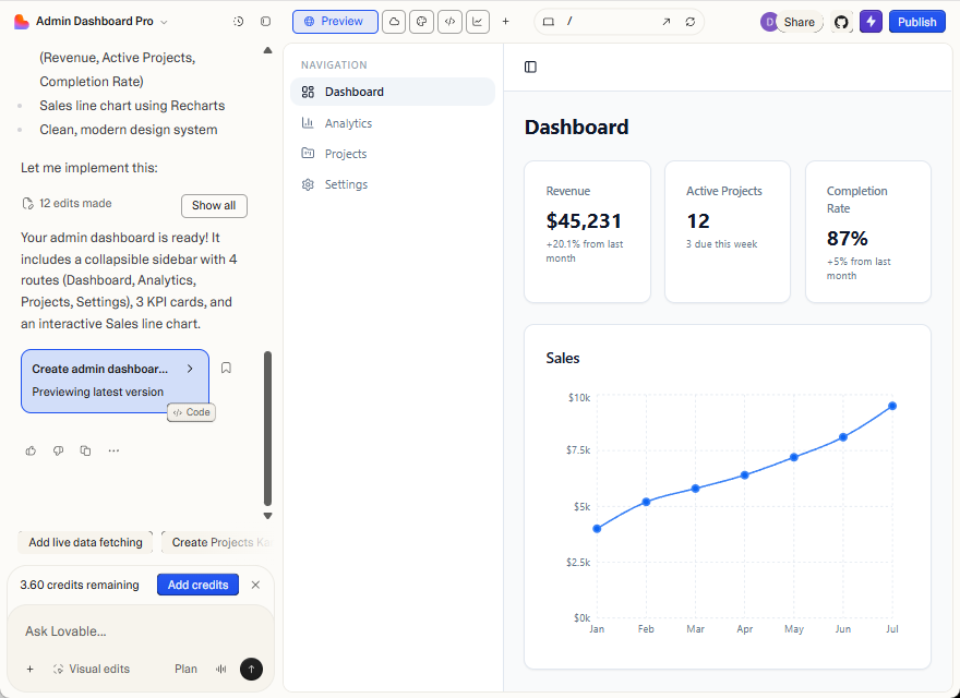
Generating a base app
Start with a standard admin layout. This prompt produces a dashboard with navigation, KPI cards, and a chart area:
Create an admin application. Requirements:
- Each navigation item opens a separate route
- The Dashboard includes KPI cards and a main content block with a Sales chart.
Once generated, continue editing in Lovable or clone the Git repository and work locally. Changes sync in both directions.
Keep the first prompt focused on structure and navigation - component-specific configuration comes next.
Adding DHTMLX React Gantt
Reference the trial package in a prompt:
Replace the Sales chart with a DHTMLX React Gantt chart using @dhtmlx/trial-react-gantt.
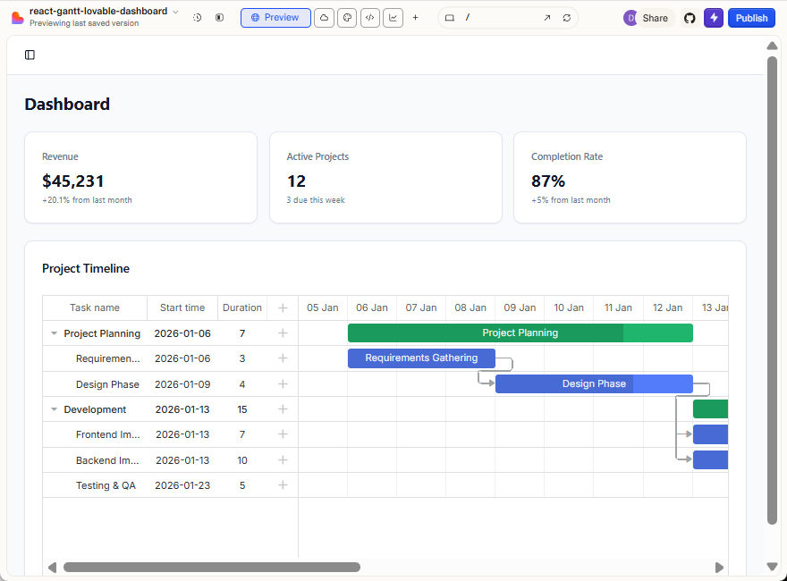
Lovable generates React apps, so the React wrapper is the natural fit. The guide uses @dhtmlx/trial-react-gantt - the evaluation build of DHTMLX React Gantt. It's publicly available on npm, which means Lovable can install it without extra setup.
The trial build is fully functional but includes an evaluation watermark. For production, switch to @dhx/react-gantt, which requires authentication with the DHTMLX private npm registry. Alternatively, add the package files to your project locally.
Lovable installs the package, creates an import, and renders a basic Gantt with sample tasks and a timeline. The output often doesn't match the API exactly - column configuration, scale setup, and data formats get guessed. The sections below show how to close that gap.
Improving output with inline prompts
When you know the exact API call, include the property name and a code snippet so Lovable doesn't guess:
Update the DHTMLX React Gantt configuration:
- Set row height to
40pxusingconfig.row_height- Pass the config object into the ReactGantt component
Example:
const config = {
  row_height: 40
};

<ReactGantt config={config} />
Works well for isolated changes. Breaks down as configuration grows - you end up pasting the same API details into every prompt.
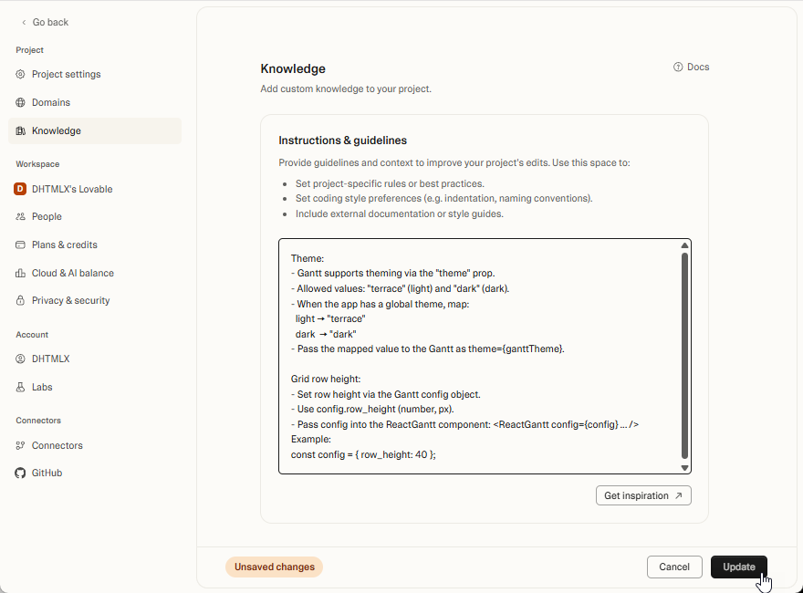
Storing rules in the Knowledge Base
The Knowledge Base stores reusable rules that apply across all prompts in a project. Define API specifics once instead of repeating them:
Theme:
- Gantt supports theming via the "theme" prop.
- Allowed values:
"terrace"(light) and"dark"(dark).- When the app has a global theme, map:
- light ->
"terrace"- dark ->
"dark"- Pass the mapped value to the Gantt as
theme={ganttTheme}.Grid row height:
Set row height via the Gantt config object.
Use
config.row_height(number, in pixels).Pass the config into the ReactGantt component:
const config = { row_height: 40 };

<ReactGantt config={config} />
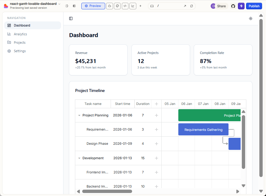
With rules in place, prompts can be short:
Use the project Knowledge Base. Set the Gantt grid row height to 60.
The Knowledge Base caps at ~100k characters - enough for a focused config reference, but not the full DHTMLX Gantt API. For broader coverage, connect MCP.
Connecting MCP for full API access
MCP (Model Context Protocol) connects Lovable to an external documentation server. It gives Lovable access to the complete, current API without manual copy-pasting.
Connect the DHTMLX MCP Server in your Lovable project settings:
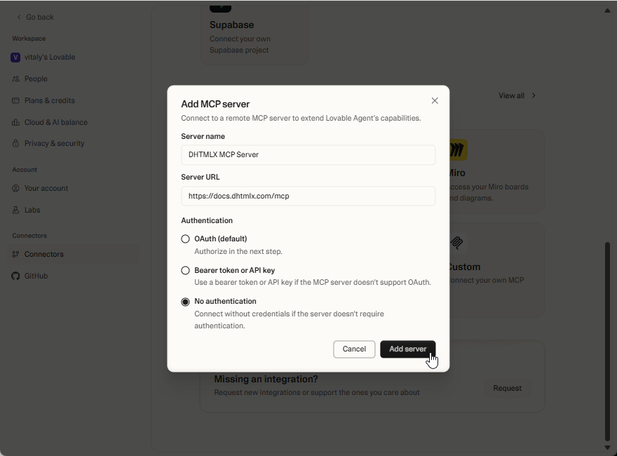
Then reference it in prompts so Lovable fetches the relevant docs before generating code:
Use the DHTMLX MCP server. Set the Gantt grid row height to 60 pixels.
Lovable resolves property names, data formats, and configuration patterns from the actual API reference instead of guessing.
Practical tips
- One change per prompt. Smaller prompts make it easier to isolate problems when the output isn't right.
- Check imports. Lovable sometimes imports from the wrong package path or mixes up named and default exports. Verify the import line after each change.
- Combine Knowledge Base and MCP. Knowledge Base for project-specific conventions (theme mapping, column layout), MCP for general API accuracy. They complement each other.
- Inspect the config object. When the Gantt doesn't render as expected, log the config object passed to
<ReactGantt />and compare it against the configuration props reference. Most issues come down to a missing or misnamed property.
What to read next
- DHTMLX React Gantt overview - component API and features
- Installation guide - setting up the professional package
- DHTMLX MCP Server - connecting MCP to other AI tools